
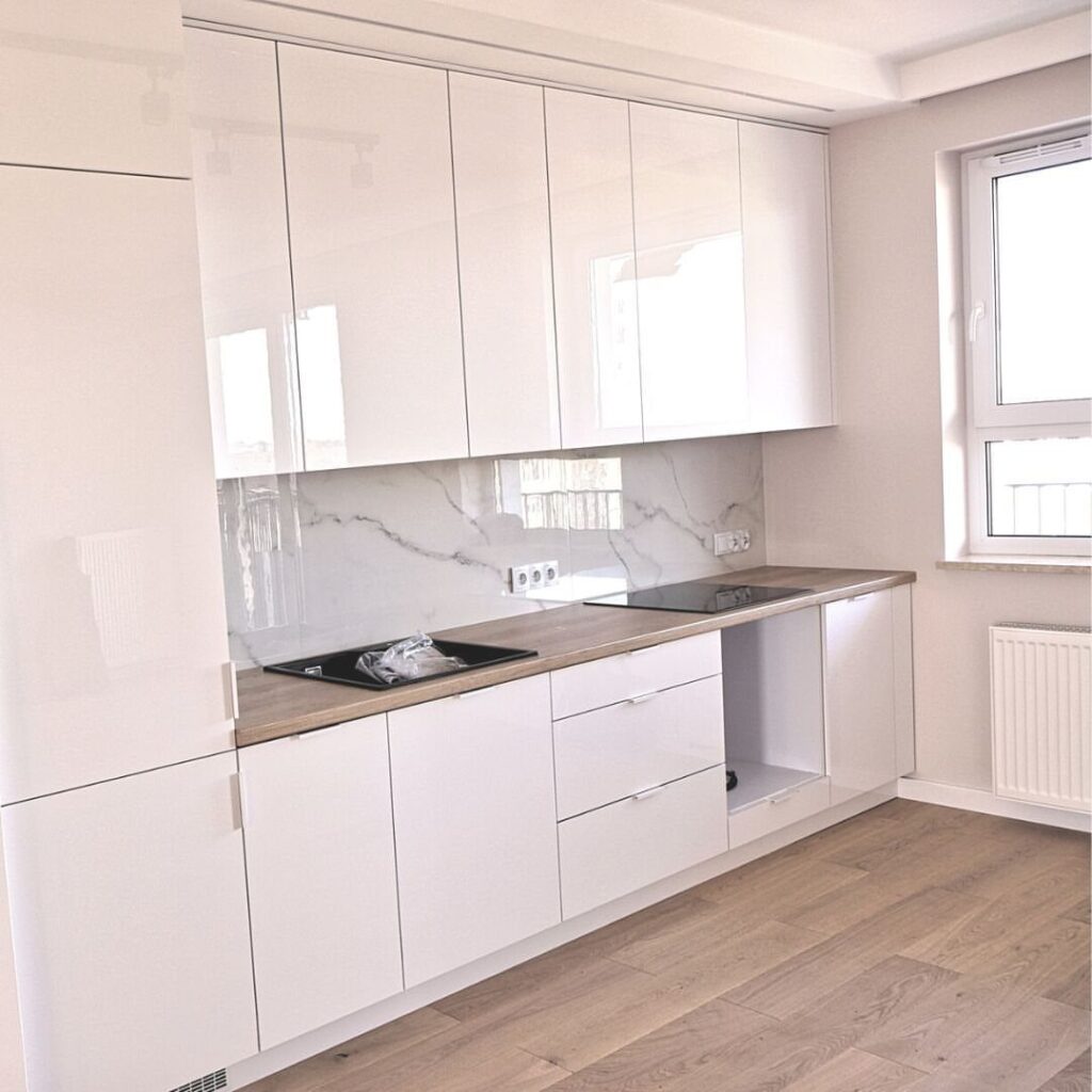
Cream shifts with the light more than white does, so the light in your own kitchen decides the shade and finish: a dim room wants a lighter cream with a glossy door, and a newer house wants one with less yellow in it.
The ideas run from a patterned runner and kitchen lighting to a navy island, marble countertops and wood flooring, with shaker doors and crown molding somewhere in between.
1. Add a Secondary Color
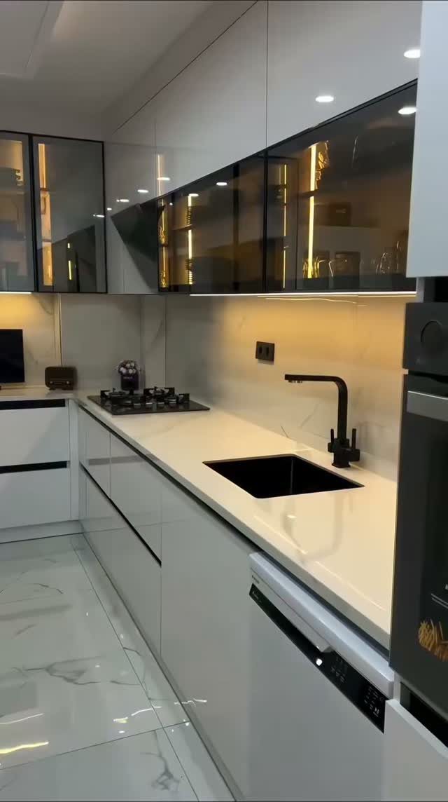
Dark glass-front uppers against white lowers give a kitchen 2 tones without repainting a single base cabinet. Only the uppers carry the second color, so the room stays light where you cook and gets depth at eye level.
The black sink, faucet and hardware echo the dark uppers, which is what ties the pairing together. If you try this, repeat the second color in at least 2 other places so it looks planned.
2. Light Cream Cabinets
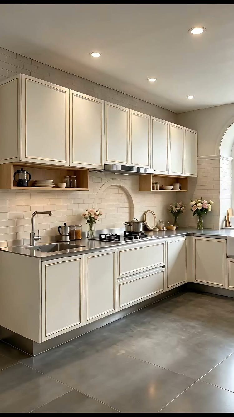
Cream cabinets give you the brightness of white without the hard, clinical edge, which is why a light shade like this one suits a kitchen that gets little direct sun.
Cream shaker doors paired with white brick walls and grey countertops keep the whole palette quiet.
I like that the arched backsplash detail adds shape without adding color. Stainless steel counters and a gas stove give the cream something cool to play against, so it doesn’t drift sleepy or yellow.
3. Cream Cabinets with Navy Island
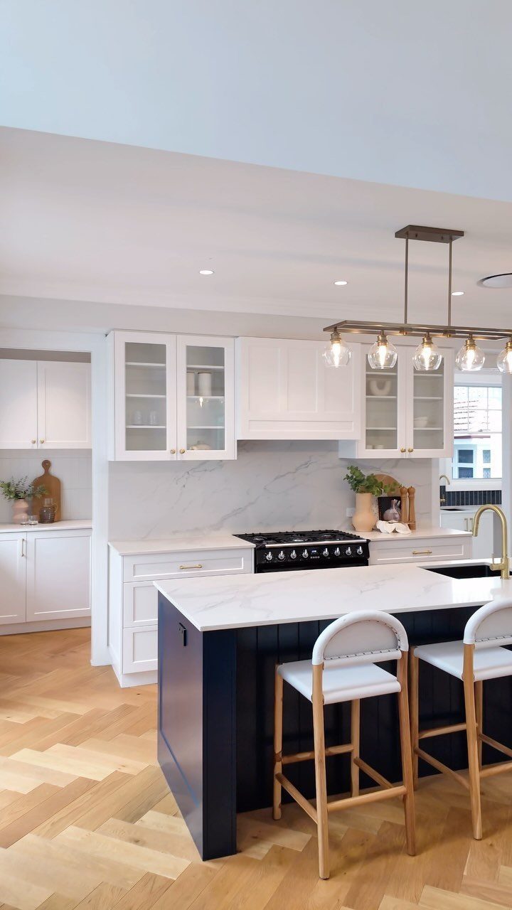
A navy island is the lowest-risk way to add real color to a cream kitchen. Paint or order just the island, and the perimeter cabinets stay neutral, which matters if resale is on your mind.
White marble on top keeps the navy from feeling heavy, and light wood herringbone flooring warms it up. I’d choose that wood tone over a grey one, because navy next to grey can turn cold fast.
4. Add Crown Molding
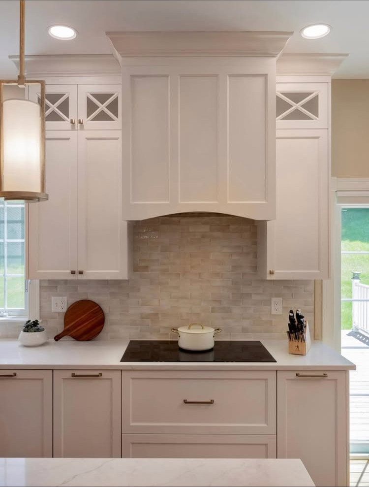
Crown molding gives cream cabinets a built-in, furniture-style finish. Keep the profile restrained, as in this shaker kitchen, where the molding runs along the range hood and cabinet tops without fuss.
Paint it the same cream as the doors so it blends into the cabinetry. A heavily ornate profile fights with plain shaker fronts, and I’d skip it.
5. Upgrade to Glass Cabinets
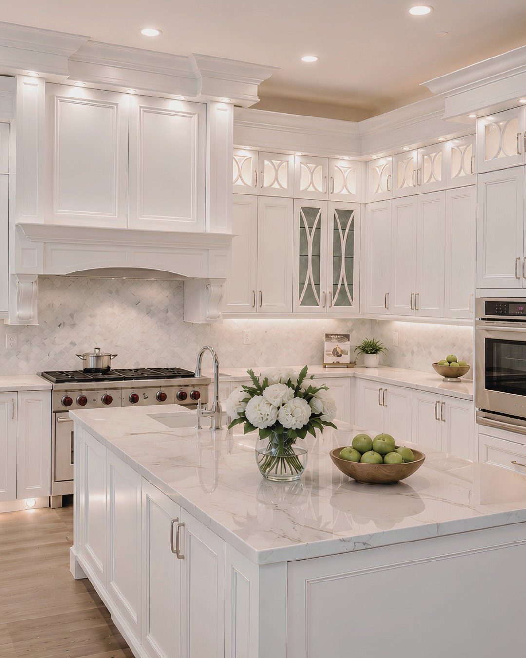
Glass-front uppers break up a wall of cream and give you a spot to show off dishes you actually love. Pair them with a marble island, as in this white kitchen, and the glass picks up light from the stone.
Limit glass to a few cabinets near the sink or range. Whatever sits behind it is on display, so only the pieces you’d happily look at every day belong there.
6. Mix Cabinet Fronts
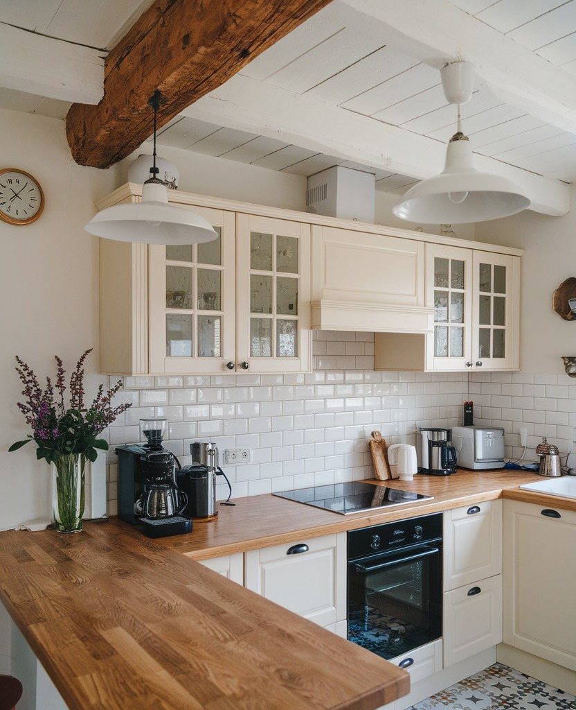
Swapping a few solid doors for glass fronts gives plain cream cabinets some variety. Here, solid and glass uppers share one wall, and the wood countertops and beam keep the mix from feeling busy.
Keep the frame style identical across both door types. Changing only the panel, not the profile, is what keeps the wall looking like one design.
7. Add Open Shelving
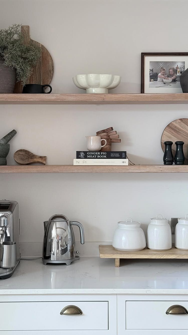
Open shelves split a wall of cream cabinetry into lighter layers, so uppers and lowers stop reading as one heavy block. Light wood against white keeps the swap warm instead of stark.
Styling decides whether this works.
I’d stick to things you use daily, like a kettle, canisters and a cookbook, and add one framed photo for personality. Leave some empty space on each shelf, because crowding turns it into clutter.
8. Add a Wood Island
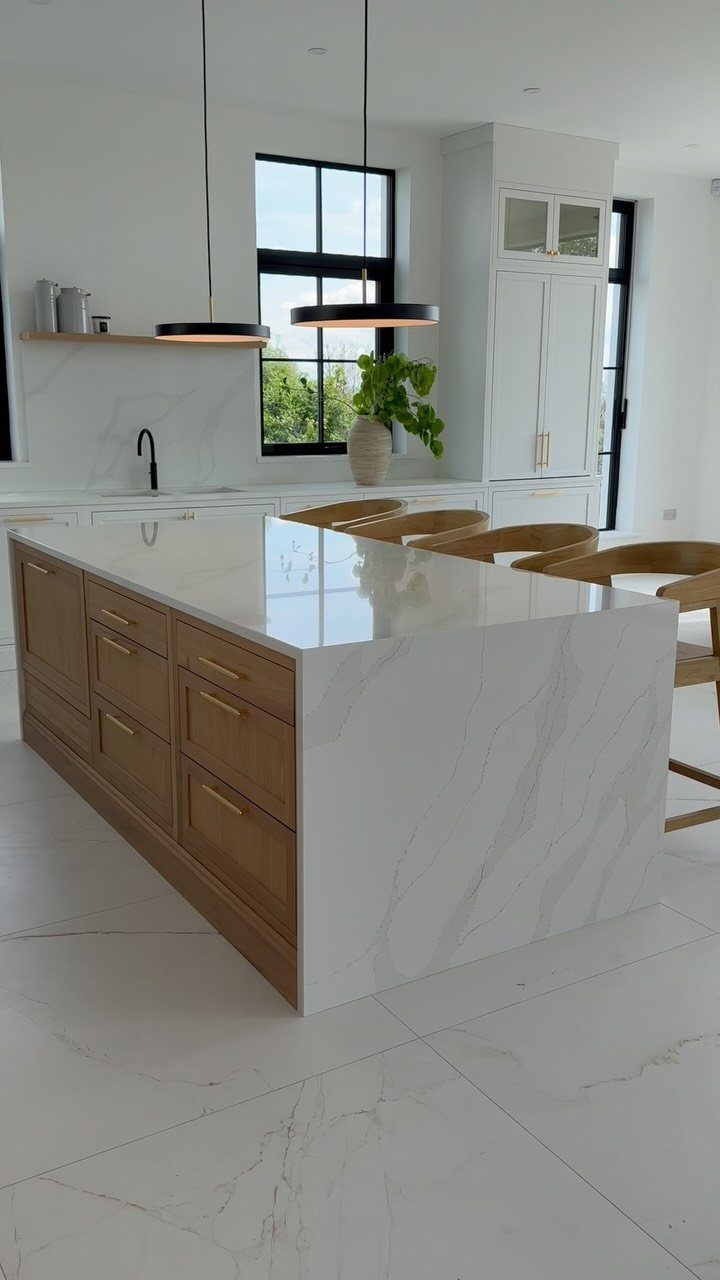
Wood drawers on the island give painted cream perimeter cabinets something to play against. The white waterfall counter keeps the wood from taking over, since the stone runs down the sides and ties back to the pale cabinets.
In a white room like this, I’d keep the wood light. A dark island would pull the eye away from the cabinets you’re trying to feature.
9. Shaker Cream Cabinets
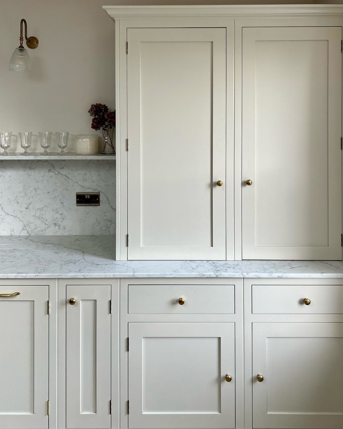
Gold pulls and knobs are what make plain shaker doors feel finished. Against cream, the warm metal looks deliberate, and white marble on the counter keeps the pairing crisp.
Pick one metal and repeat it on every door and drawer. I’d also leave room for a short shelf of glassware, as here, so the run of doors gets a pause.
10. Consider Kitchen Lighting
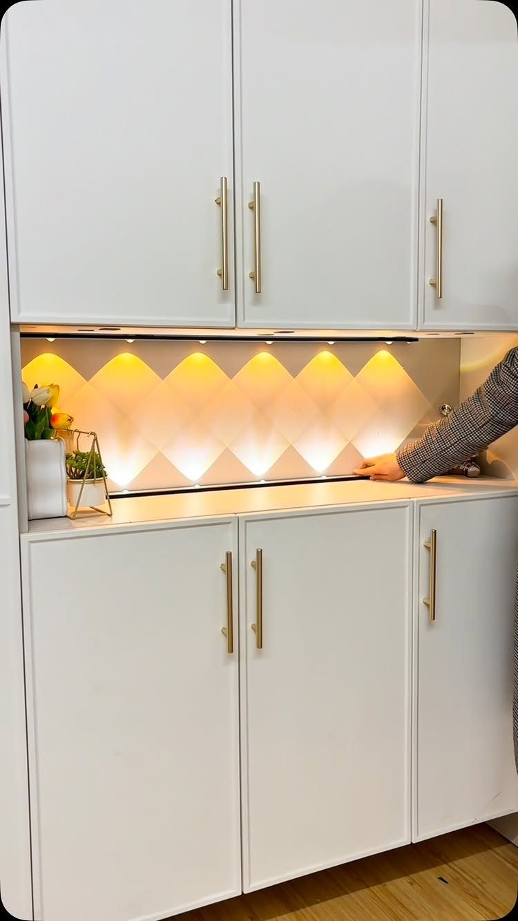
Under-cabinet lighting washes the backsplash and counter in warm light, which is what keeps cream and white from feeling clinical after dark.
Warm gold hardware picks up the glow of warm-toned bulbs, so the metal and the light work together; with cool white bulbs the same pulls can look flat.
Look for bulbs or strips labeled warm white; cool white reads flat against cream. A dimmer is worth adding if you can, so the same kitchen can go from task-bright to soft.
11. Add Wood Flooring
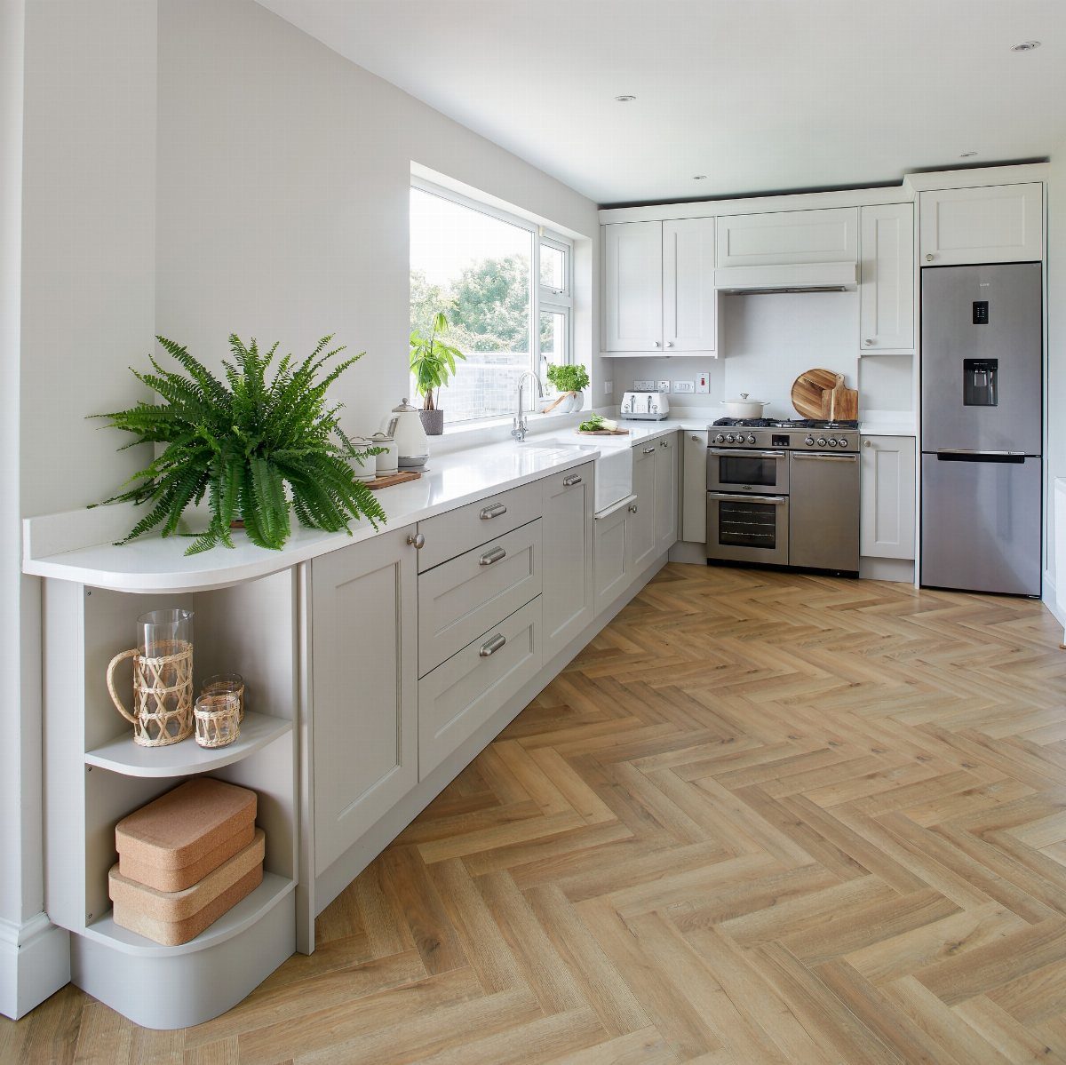
Wood grain gives cream cabinets the texture that painted doors can’t. A light herringbone floor adds movement underfoot while the cabinets and white counters stay plain.
I’d choose a tone with a little warmth in it, since the floor is doing the job cream alone can’t.
Stainless appliances sit comfortably against cream cabinets and wood floors, and a green plant on the counter adds color without any extra work.
12. Cream Kitchen and Dining Room
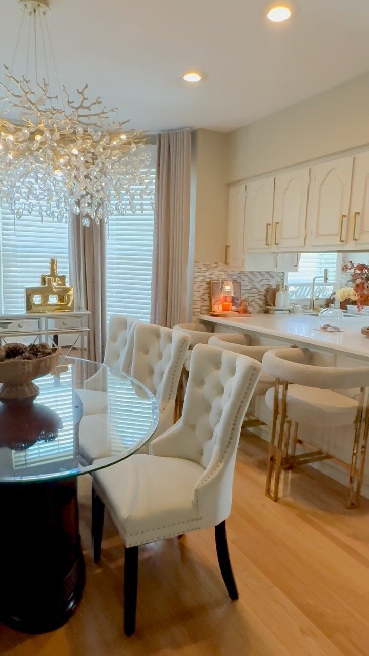
In an open plan, the dining area has to agree with the cabinets first. Repeating cream in the chair upholstery links the kitchen and dining zones without matching anything exactly.
A glass table keeps sightlines open, so the kitchen still reads as part of the room. One chandelier gives the dining side its own focal point, and I’d stop at one.
13. Add a Patterned Runner
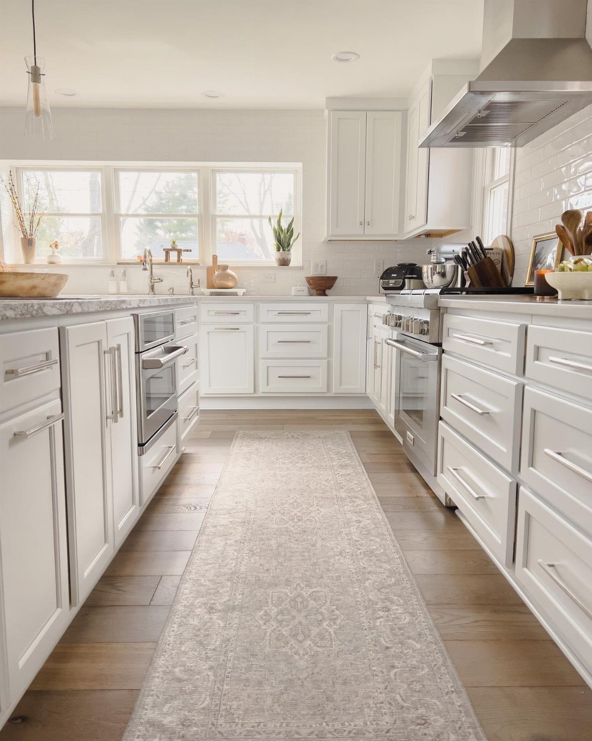
A long runner is the cheapest way to bring pattern into a kitchen of white cabinets and pale floors.
Light grey keeps it quiet, and the print breaks up a stretch of wood that would otherwise read as one flat plane.
Pick a runner that leaves a strip of floor showing on both sides, so it sits like a path down the room.
I’d choose a low pile, since a shaggy rug in a kitchen catches crumbs and chair legs. A non-slip pad underneath is worth the few extra dollars.
14. Marble Countertops
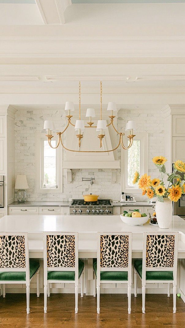
Marble on both the counters and the backsplash makes a white kitchen look cut from one piece. The veining supplies the movement, so the cabinets can stay plain.
The maker of this kitchen worried about being locked into one color scheme or tired of a pattern in two years.
Marble answers that better than most finishes, because it is a neutral. Gold lighting, as here, can be swapped later, and so can the chairs.
I’d put the bold pattern on the seating and let the stone stay calm. Chairs are far easier to replace than a countertop.
Cream Kitchen Appeal and Longevity
Cream has been used in kitchens for a long time, and that history is the best argument for it. It sits comfortably in modern and traditional rooms alike, and it feels warmer than pure white.
Cream may also help at resale, since buyers respond to a polished kitchen. No paint color guarantees that, but a soft neutral rarely works against you.
Shade decides how dated it looks. A rich, yellow-leaning cream carries a nostalgic, traditional feel, so it suits a home whose architecture matches, with something like an apron-front sink or a plate rack.
In a newer house, I’d pick a lighter, less yellow cream. Most cabinet manufacturers now sell several cream shades, so you can choose the undertone instead of settling for one.
Lighting Changes Cream Appearance
Cream shifts with the light more than white does, so judge it in the room where it will live. Paint a large sample and check it in the morning, afternoon and evening, with the lights on and off.
Room direction matters.
Sheen counts too. A glossy finish bounces more light around, so it suits a small or dim kitchen, while a matte or textured door looks softer and hides glare.
The room feels bigger and brighter, and a darker beige or yellow wall color pulls it back to an older look.
No single cream works in every kitchen, because every room gets different light.
Practicality and Maintenance Tradeoffs
Cream off-white hides fingerprints, small marks, scratches and dings better than pure white. If your kitchen gets daily use, that is a real reason to pick cream over white.
It does not beat a darker color, though.
Both white and cream show smudges and fingerprints faster than darker colors do, but cream hides them a little better than white, which makes it the more forgiving pick among light cabinets only.
Be honest about how much you cook and how much wiping you’ll tolerate. If you’ll clean as you go, cream is fine; if you won’t, a darker cabinet color will look better for longer.
Frequently Asked Questions
What is the best creamy white color for kitchen cabinets?
It depends on the house. A lighter, less yellow cream suits a newer home, and a richer, yellow-leaning cream suits one with traditional details like an apron-front sink.
Benjamin Moore Muslin is a warm neutral that reads as cream, and Sherwin Williams Believable Buff looks beige on the swatch but creamy once it’s on cabinets.
Tape a big painted swatch to the cabinet wall and look at it at 8 a.m., mid-afternoon and after dark, with the lights on and again with them off.
Are cream kitchen cabinets still in style?
Yes.
Cream has a long history in kitchens and is returning in lighter, fresher shades than the old builder-beige. Light, quiet wall paint keeps cream looking fresh, while tan or butter-yellow walls make the cabinets look dated fast.
What color hardware looks best on cream cabinets?
Gold is my first pick, especially on plain shaker doors, where the warm metal makes the cabinets look finished.
Black, brushed nickel and chrome also work. Look at the cream’s undertone before buying pulls: brass and black suit a deep, golden cream, and a paler, beige-leaning one can also take chrome or brushed nickel.
Pick a single finish for every knob and pull so the hardware reads as one set.
Can I have white walls with cream kitchen cabinets?
Yes, as long as the undertones agree. A cream with a lot of yellow in it needs a softer white on the walls, since bright white next to it feels harsh and cold.
A pale cream close to off-white holds up fine against crisp white walls; the deeper the cream, the softer the wall color should be.
What countertop goes best with cream kitchen cabinets?
Marble is the classic choice, and granite or quartz in brown, gold, cream, white or black also work.
Marble with gray veining gives a cream kitchen its crisp edge, and the pattern does the decorating so the doors can stay simple.
Check undertones first, because a cold, bright white slab beside a deep golden cream will clash. Set samples side by side before you buy.