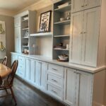
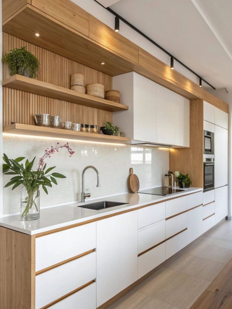
Your countertop and floor decide which of these cabinets is yours, because every fixed surface carries a warm, cool, pink, green or yellow undertone, and the cabinet color has to agree with it.
Choices span creamy whites like Swiss Coffee and Joa’s White, soft oatmeals, greige, beige and taupe, and then go darker with charcoal and black cabinets.
Cabinets are the expensive thing to redo, so match them to the surfaces you’re keeping, not the other way around.
1. Greige Cabinets
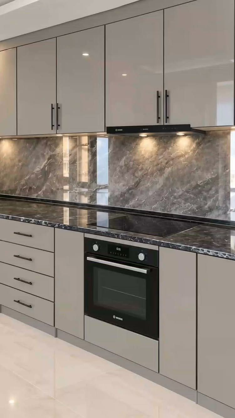
Greige splits the difference between gray and beige, so it doesn’t lean fully warm or cool. That makes it an easy answer if your floors or counters pull in either direction.
A glossy finish makes greige read sleeker, and black hardware or dark marble keeps it from feeling soft.
I’d pick it when I can’t decide between the 2 camps. Paint a sample board and check it in morning and evening light before you buy a full gallon.
2. Classic Gray
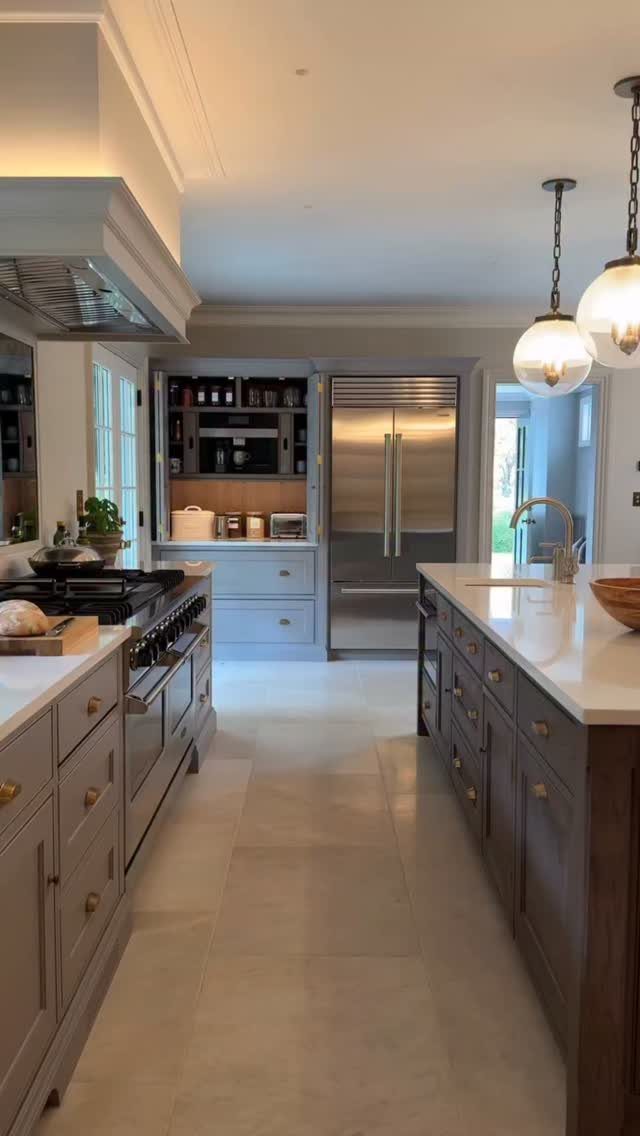
Off-white is often how this gray reads. Classic Gray is a light, warm gray, and next to white countertops it looks more like a softened white than a true gray.
I like it for people who want gray on the label but not a strong color on the wall.
Anyone after a clearly visible gray may be disappointed by this one. Hold a sample against your countertop before deciding.
3. Oatmeal Cabinets
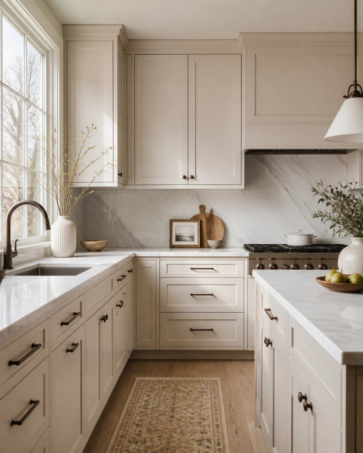
Cream, taupe and beige all show up in oatmeal, and none of them wins. That blend gives the cabinets warmth and depth while keeping the color light.
White marble counters and a light wood floor let the shade stay pale.
I’d choose oatmeal over plain white if a kitchen feels cold. Look at a sample next to your flooring first, since the undertone shifts depending on what sits beside it.
Corine Maggio, of Corine Maggio Design, agrees. ‘White kitchens show everything – every splash, smudge, and hard-water mark. Oatmeal has the same neutral versatility but with warmth and forgiveness built in; it ages gracefully rather than looking tired,’ she says.
4. Baby Fawn
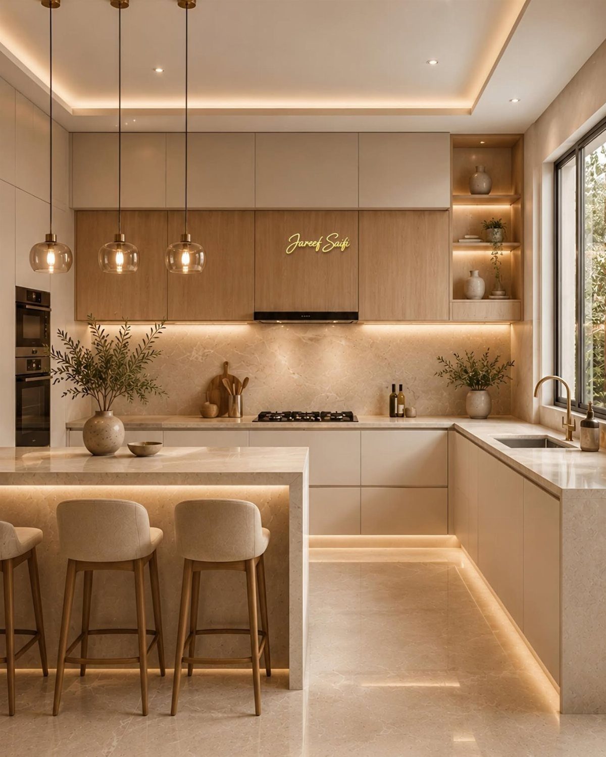
Tan is the risk with warm neutrals, and Baby Fawn steers around it. It’s a soft, warm oatmeal that stays on the lighter, creamier side.
Painting the island to match the perimeter cabinets, as this kitchen does, keeps the color consistent across the room.
A marble top gives it a clean partner. Compare it against other oatmeal samples, because the differences are small and only show side by side.
5. Creamy White
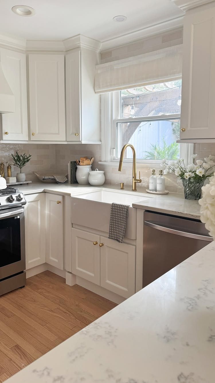
Gold hardware and creamy white cabinets make a pairing I keep coming back to. The off-white warms the room, yet the kitchen still feels light and bright.
Compared with a stark white, cream is kinder to a kitchen with little daylight. If you’re painting the cabinets yourself, pick your hardware finish first and judge the cream against it.
6. Beige and Taupe
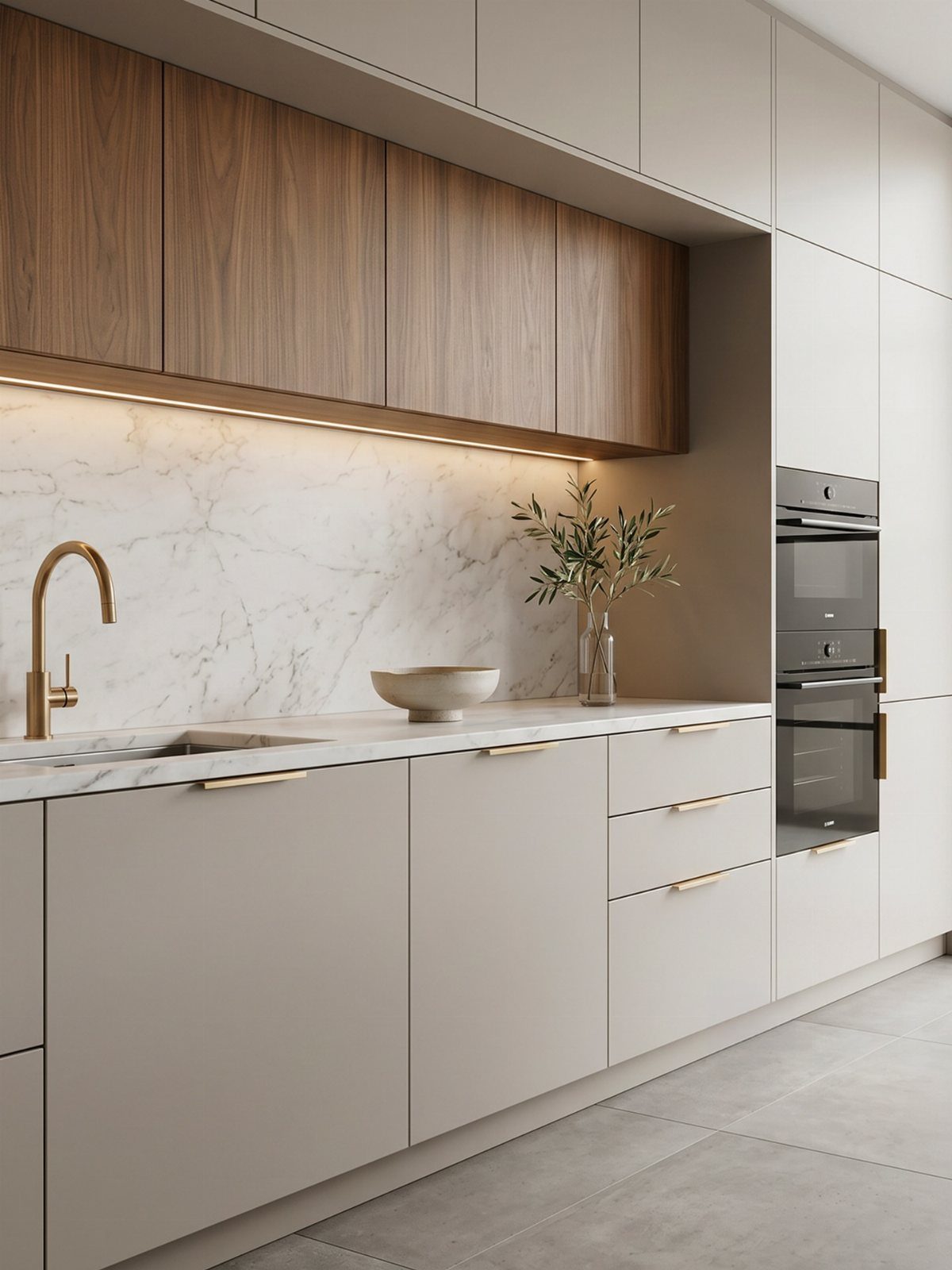
Two-tone is the easiest way to use taupe and beige. Beige lowers with wood uppers, as in this kitchen, give you earthy color without painting every door.
These shades sit between cream, beige and gray, which makes them cozy rather than crisp. I’d keep any wood close to walnut in tone so it doesn’t compete with the cabinets.
7. Accessible Beige
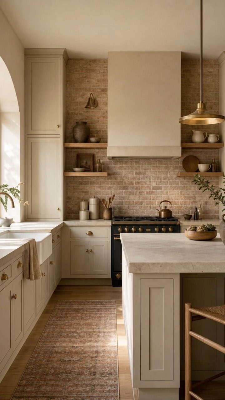
Brick behind the range and a dark blue stove are a lot of color, and beige shaker cabinets keep that kitchen calm. Accessible Beige is an earthy beige that reads warm without turning gray or yellow.
I’d choose it for a kitchen with strong elements already in place, since it lets them stand out.
Marble on the island keeps the whole look light. Test a sample next to your backsplash before committing.
8. Natural Cream
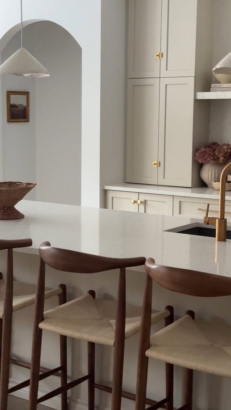
Anyone chasing an all-white kitchen without the starkness should look at Natural Cream. It’s a creamy greige, so it reads as white from across the room and softer up close.
Gold hardware and a gold faucet suit it well, and I’d match the 2 metals so the finish looks planned.
Wood barstools with woven seats add texture. Brush out a sample beside your countertop, because greige can pull cooler or warmer next to white.
9. Revere Pewter
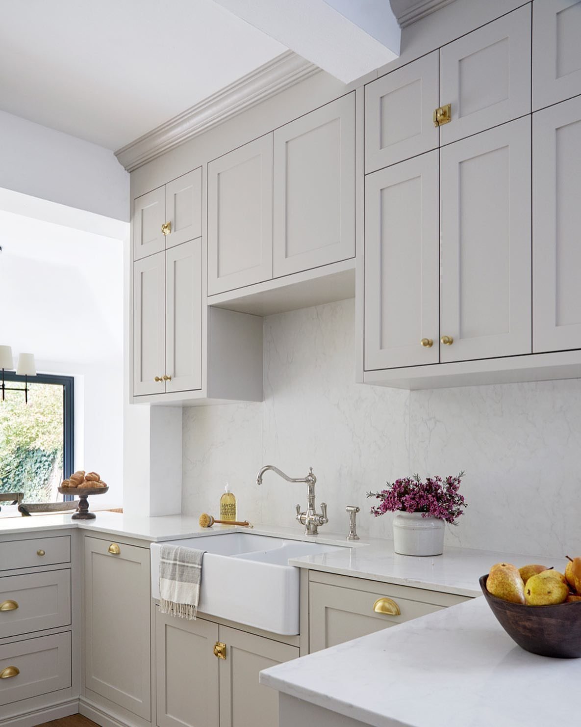
Revere Pewter is the greige I’d reach for when a kitchen needs coziness but you still want it to feel timeless. It’s warm, light and easy to live with.
Marble counters and a marble backsplash keep it from going flat, and gold hardware adds a bit of glow.
A white farmhouse sink stays crisp against the greige. Because it’s so versatile, it’s a safe pick if resale is on your mind.
10. Cool Arbour
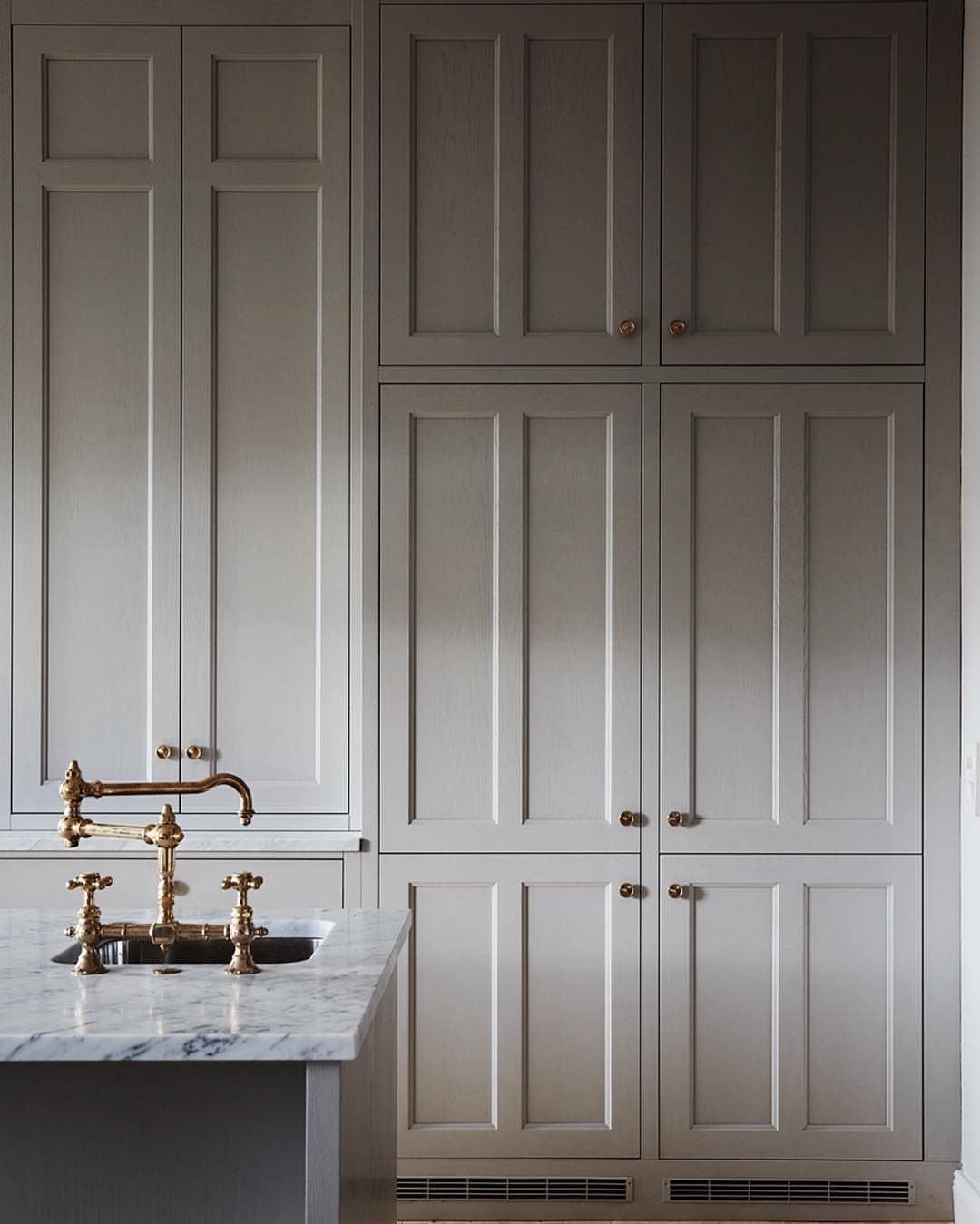
Green hides inside Cool Arbour. It’s a moody gray-green neutral with a slight khaki-green undertone, so it feels like a color without shouting like one.
White marble counters keep it from feeling heavy, and gold knobs and a gold faucet warm it up.
I’d choose this over a standard gray if you want something with more personality. Paint a large sample and watch it through a full day, since the green shows most in certain light.
11. Swiss Coffee
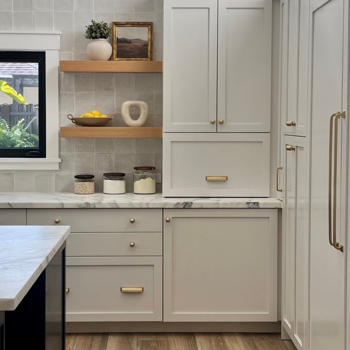
Not every kitchen gets generous daylight, and Swiss Coffee is a warm, creamy white that doesn’t depend on it. That makes it a strong choice for a darker room.
White marble counters keep the cream from looking yellow, and gold handles add warmth.
Light wood floating shelves suit Swiss Coffee cabinets because their warm grain keeps the soft look from going flat. I’d pick it over a brighter white if the room feels harsh under evening light.
12. Charcoal Cabinets
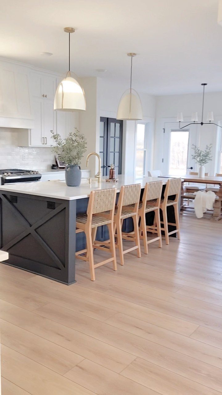
A charcoal island with X-brace detailing grounds a kitchen with white upper cabinets, and the contrast gives the room weight without darkening the walls. Painting only the island is a smaller commitment than a full set of dark cabinets.
White countertops keep the dark base from feeling heavy, and woven rattan stools soften it.
Two large dome pendants over the island finish the look. I’d go charcoal if you want a contemporary focal point without darkening the whole room.
13. Repose Gray
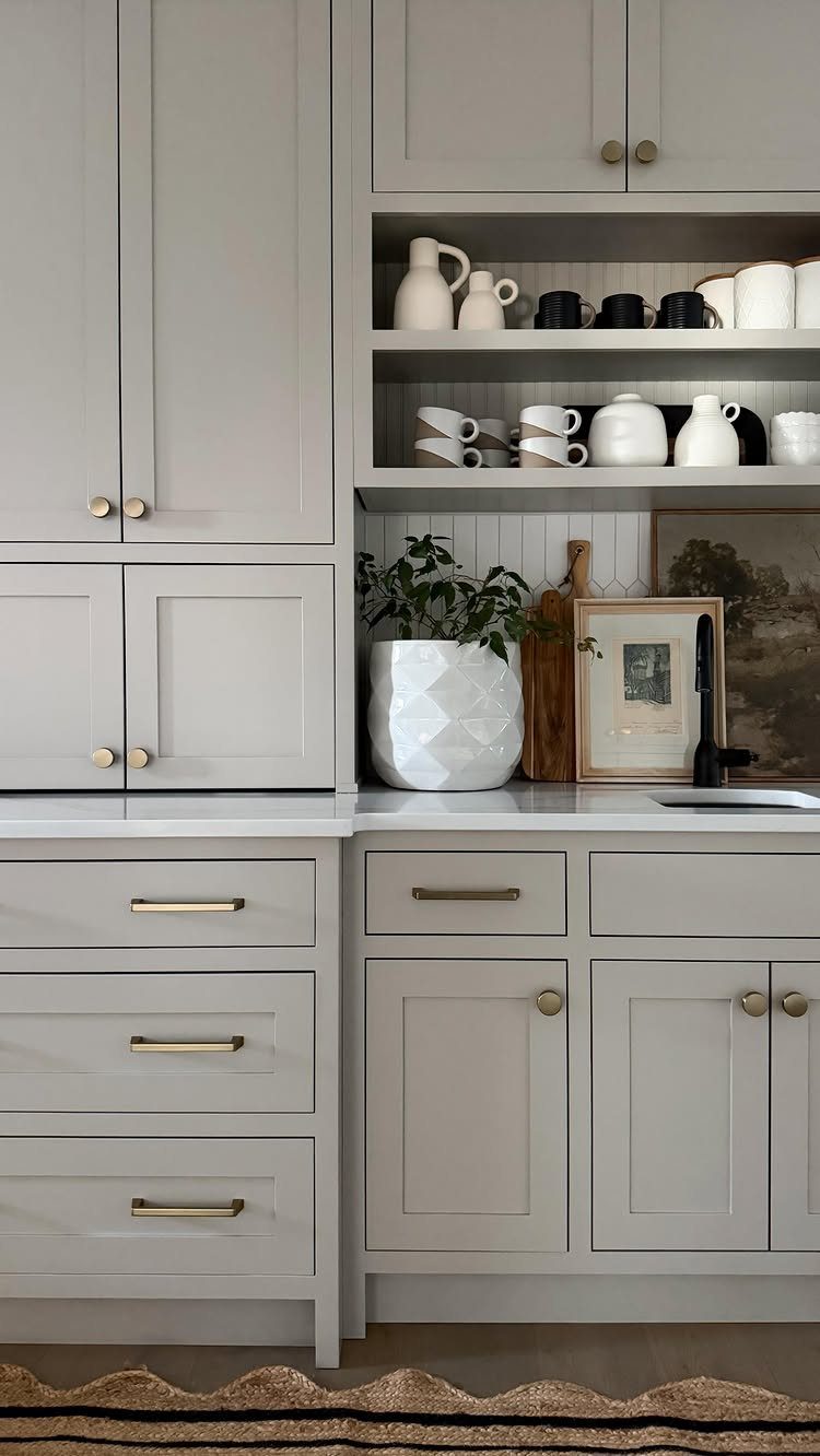
Taupe is where Repose Gray often lands, even though the name says gray. It’s a warm gray, so it can read closer to greige than to a cool, steely shade.
Repose Gray pairs best with white countertops and warm gold pulls, and a run of open shelving with white dishes keeps a full wall of it from feeling heavy.
I’d pick it for a kitchen where a true gray would feel chilly. Before you buy a full gallon, tape a sample board beside the counter and look at it in both morning and late-afternoon light.
14. Black Cabinets
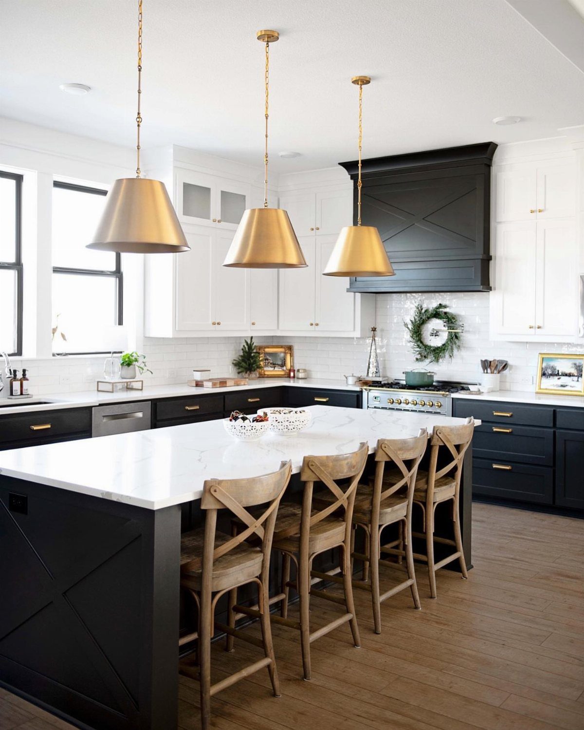
Black lower cabinets under white uppers give a kitchen a clear top and bottom, and an island in black anchors the room. A black range hood repeats the color overhead, so the dark doesn’t sit only at floor level.
White marble countertops and gold pendants keep it chic rather than heavy.
Wood barstools add warmth against the black. I’d go with black on the base only if you want contemporary or industrial character without a fully dark room.
15. Joa’s White
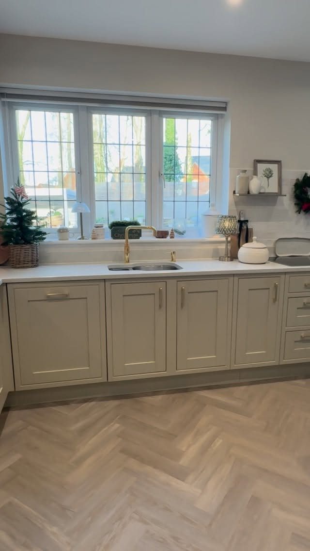
A little black pigment sits inside Joa’s White, which is why it reads as a light taupe instead of a plain off-white. The undertones are cozy, and shaker doors let the color carry the look.
A white countertop and a gold faucet keep it fresh, and herringbone wood flooring adds pattern without competing.
I’d choose it if you want warmth but find cream too sweet. Sample it near your biggest window, since light changes how taupe reads.
16. Shiitake Cabinets
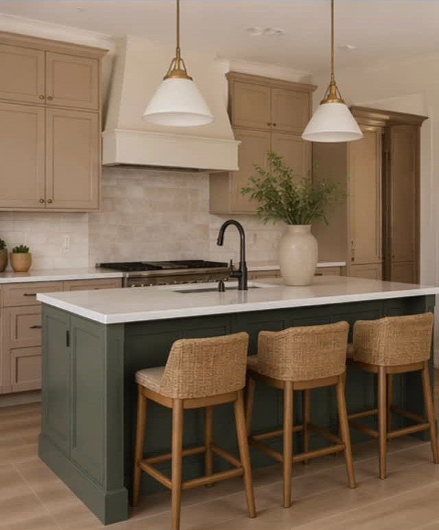
Shiitake can shift from a medium-deep tone to a soft off-white as the light changes, so it never looks quite the same twice in a day.
The maker of this kitchen calls it warm, earthy cabinetry that softens the whole space.
Taupe uppers take well to a dark green island, which adds contrast without clashing, and woven barstools in rattan or seagrass bridge the two. I’d paint a large sample and watch it from morning to night before deciding.
Test Samples in Kitchen Lighting
Stick-on sample sheets, such as the ones Hello Paint makes, go right onto a wall or cabinet door and peel off when you’re done.
A small test pot from the paint store does the job too; brush it onto a scrap board or any spare piece of wood or cardboard.
Size matters. A small swatch won’t give you a true reading, so make the sample big enough to judge, and put it where the cabinets will actually hang.
Whatever sits around a color, along with the shape of the room, shifts how it reads once the cabinets are in.
Give it a couple of days.
Weather moves the light as much as the hour does, so a gray morning and a sunny afternoon can show you different colors. Look again in the evening with your lamps and overhead lights on.
Pay extra attention if the room gets little daylight. Lighter tones feel brighter and more open there, while darker shades add depth but can make the space feel closed in.
Coordinate Existing Fixed Materials
Start with the countertop. Settle on one material that fits your budget and taste, then choose the cabinet and wall colors to follow it.
Every fixed surface has a color hiding in it. Look at the countertop, backsplash, floor and any architectural features you’re keeping, and name the undertone of each one: warm, cool, pink, green or yellow.
A cabinet color that fights those undertones will look off even if it’s lovely on its own.
Walls are cheap to repaint. Cabinets are not, and redoing them is a big job, so settle the fixed materials first and the cabinet color last.
A kitchen designer can read the undertones in your countertop and tell you whether lighter or darker cabinets will work in your room. They can steer you toward backsplash materials that give the best value, too.
Frequently Asked Questions
What is the best neutral color for kitchen cabinets?
For a color that works in most kitchens, I land on Revere Pewter, a greige that stays warm and light without turning yellow or gray, and buyers tend to like it too.
Walls are cheap to repaint and cabinets are not, so settle the fixed surfaces first, then check a large sample in morning and evening light.
What kitchen cabinet colors will look outdated in 2026?
I can’t predict a specific year, but bold pops of color on cabinets are the usual source of regret, since they can lose their appeal within a few years and leave you wishing for new doors.
One designer also calls cool ‘millennial gray’ off-limits. Neutral cabinets sidestep that risk, and you can add color later through easier-to-change pieces.
What colors to avoid in kitchen cabinets?
Skip any color whose undertone fights your countertop, backsplash or floor, because it looks off even when it’s lovely on its own.
A kitchen with weak daylight handles dark cabinets and stark white badly: the dark shades can close the room in, while a bright white turns cold and glaring, so a creamy white is the safer pick.
If you want a clearly visible gray, avoid Classic Gray, which is a light, warm gray that often reads as a softened white.