
The ideas run from quiet sand and ivory to glossy red cabinets and orange against patterned tile, and from a full cabinet repaint down to swapping gold handles with a screwdriver in an afternoon.
Cabinets, floors and counters cost real money, so I would settle light and size before falling for any palette.
1. Blue and White
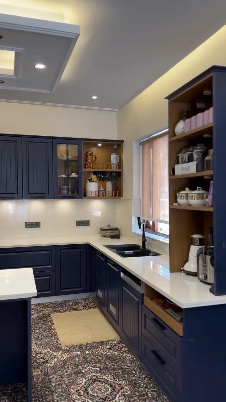
Navy against white is the highest-contrast version of this pairing, and I would pick it over a pale blue for a kitchen that needs a clear edge. White counters stop the dark cabinets from reading as a heavy block.
A wood shelf unit and a patterned rug add warmth so the 2 colors don’t read cold. If navy feels like too much, pale blue cabinets with the same white give a softer look.
2. Blue and Grey
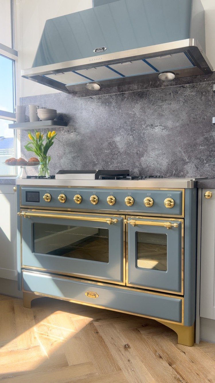
Grey stone gives a blue range somewhere calm to stand.
Putting the color into the appliances instead of the cabinets is a bold move, and I like it because the grey backdrop lets blue be the only loud thing in the room.
Gold handles and knobs add a warm note against the cool pair. For a quieter take, choose a soft blue; for drama, go deep.
3. Pink and Green
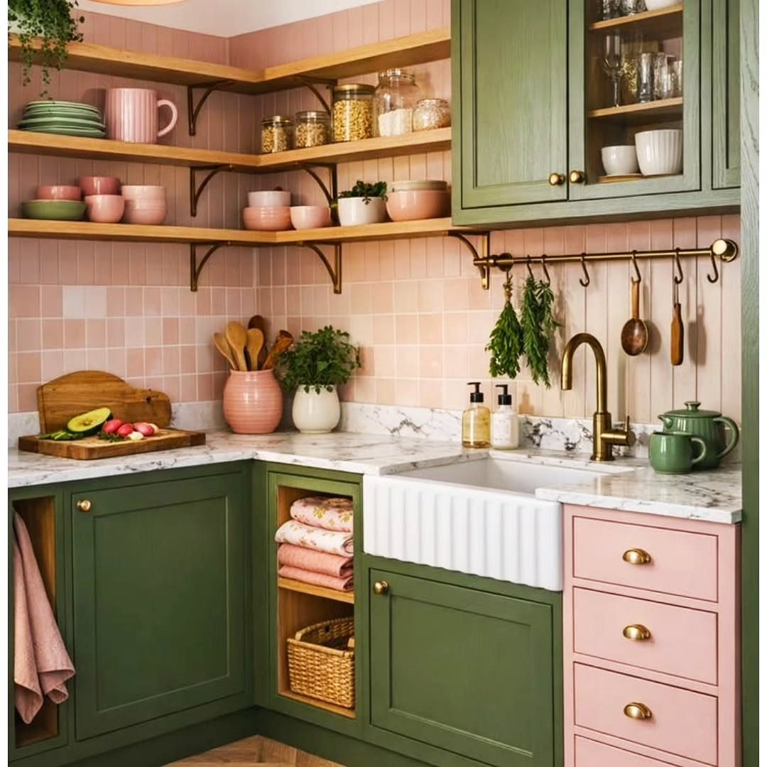
Pink tile with green cabinets sounds risky, and it works when the pink is soft and the green is allowed to be the anchor.
I would keep the counters white marble and the sink white, as here, so the 2 colors get all the attention.
Blush is the safer pink.
A stronger pink pushes the room toward playful. Pick one color to lead, and give the other a smaller supporting role.
4. Green and Grey
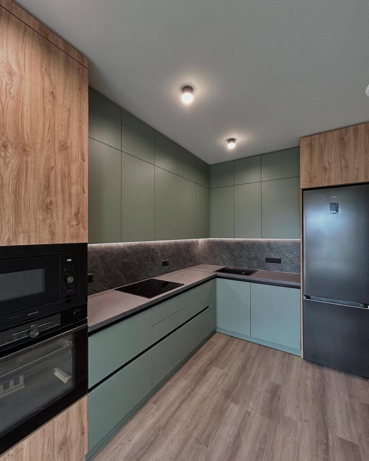
Sage can turn sweet fast, and grey is what holds it in check. Grey counters and backsplash take the sugar out of the green and leave a calm, modern kitchen.
Light wood-grain accents bring warmth, and a black oven adds one sharp edge. I would choose this over green with white if you want something less expected that still stays quiet.
5. Green and Brown
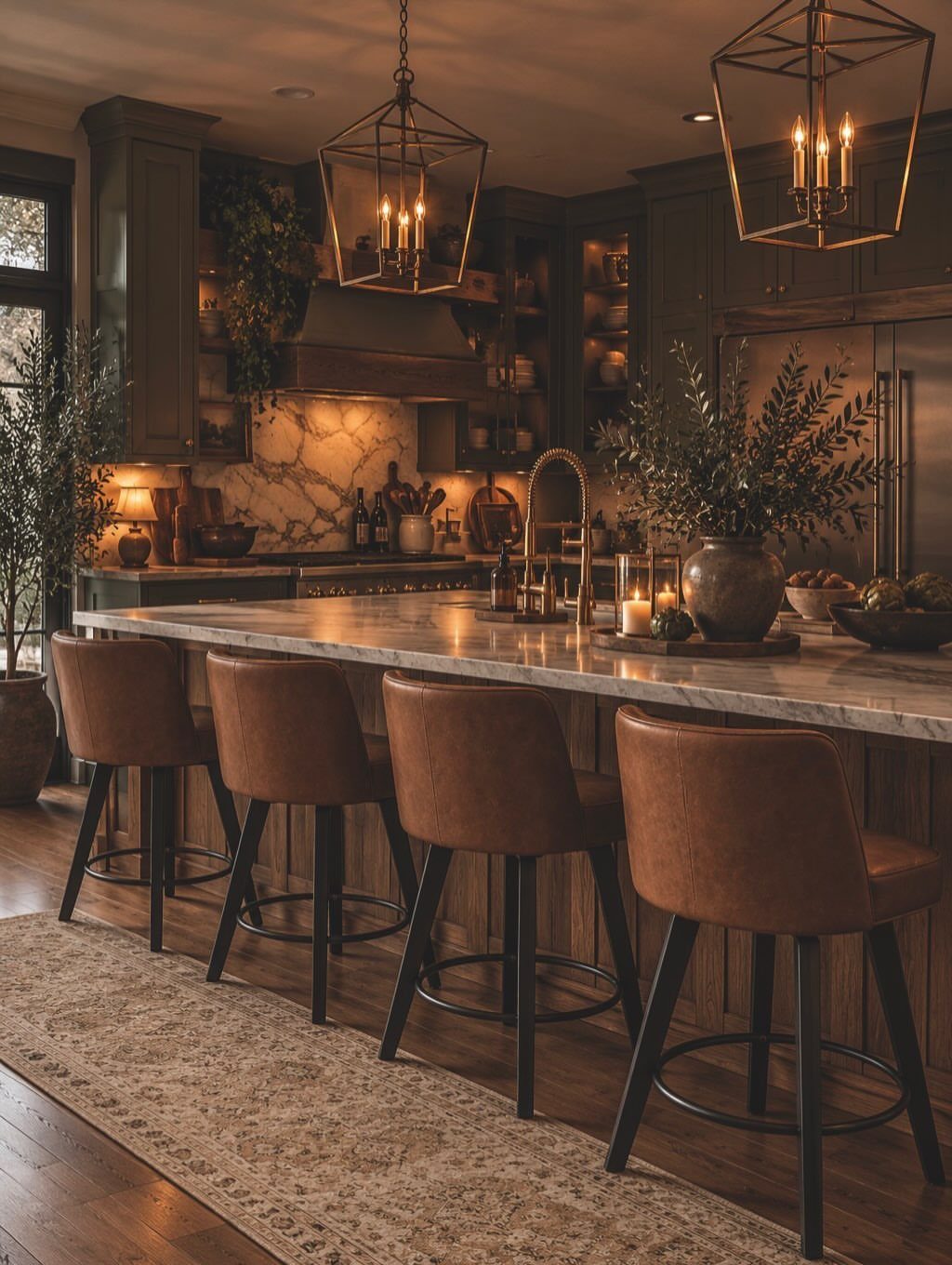
Brown is the partner that makes dark green feel lived in. Leather barstools at the island are the easiest way to add it, since seating can be swapped without touching the cabinets.
White marble counters give the deep green room to breathe. If leather isn’t your style, a tan or wood tone does the same job.
6. Beautifully Blue
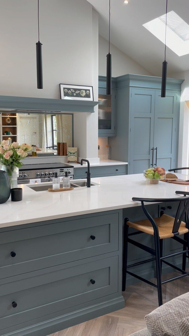
Light grey walls act like a mat around a deep, muted blue.
Painting only the cabinets dark and leaving the walls pale puts all the weight in one place, which I find easier to live with than blue on every surface.
I would hold the black to a few pieces.
7. Bold Blue and Soft Blue
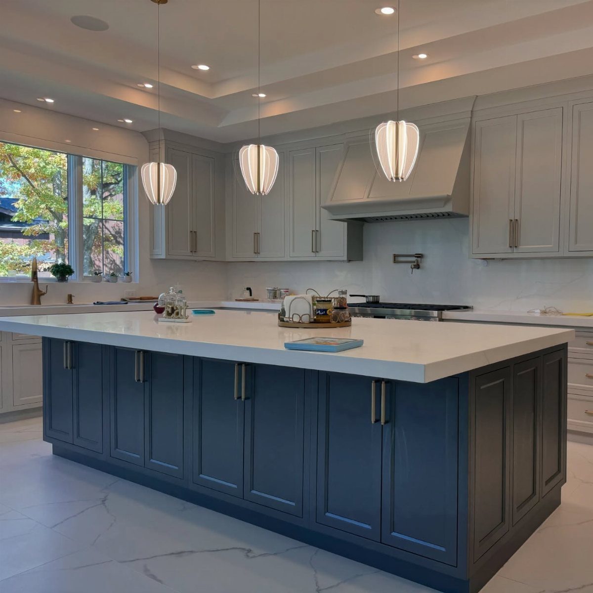
2 blues do the work that a trim color or a backsplash would do in a plainer kitchen.
Navy on the island with a white top, and a lighter blue-grey on the perimeter cabinets, gives flat doors a sense of depth.
My pick is to limit the dark blue to the island and let the soft blue cover the rest of the cabinets. It becomes the anchor, and the pale run behind it stays easy on the eye.
Choose the 2 blues from the same undertone family, or they will fight. Test both paint samples side by side in your own light before you commit.
8. White and Wood
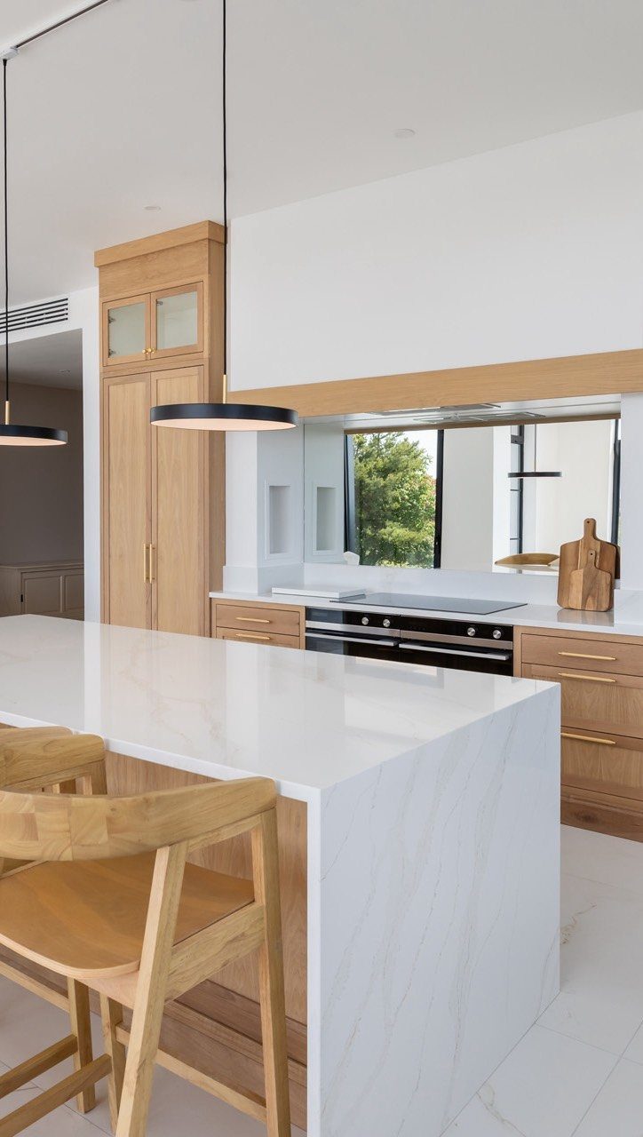
Bright white can look sterile, and light wood is the quickest fix I know. Oak-toned cabinets and stools against white marble counters give the room a bit of grain to rest on.
Keep the wood tone consistent across cabinets and seating so it reads as one choice rather than three. A mirrored backsplash like this one pulls in whatever green sits outside the window, which makes a small white kitchen feel bigger.
If marble is out of budget, a white counter in any material still works with the wood.
9. Cream and Black
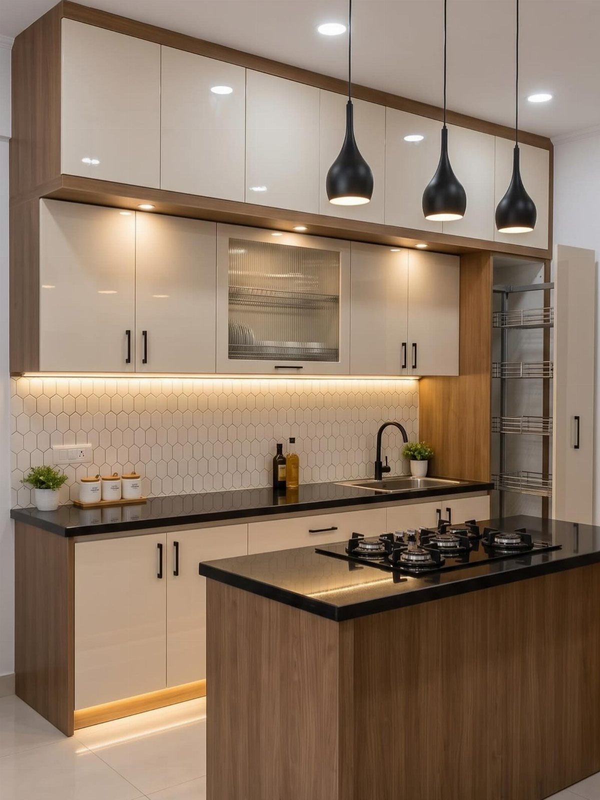
Cream softens black in a way pure white never does. Cream cabinets above and below, with black counters and black pendants, give you contrast without the sharp, cold look of a black-and-white kitchen.
A white hexagonal backsplash is a good middle ground, since it keeps the wall light and lets the counters and lights carry the dark notes.
Add a touch of wood, such as a cutting board or a stool, and the cream feels warmer still.
I would hold the black to counters and lights so the room doesn’t tip heavy.
10. Black and Wood
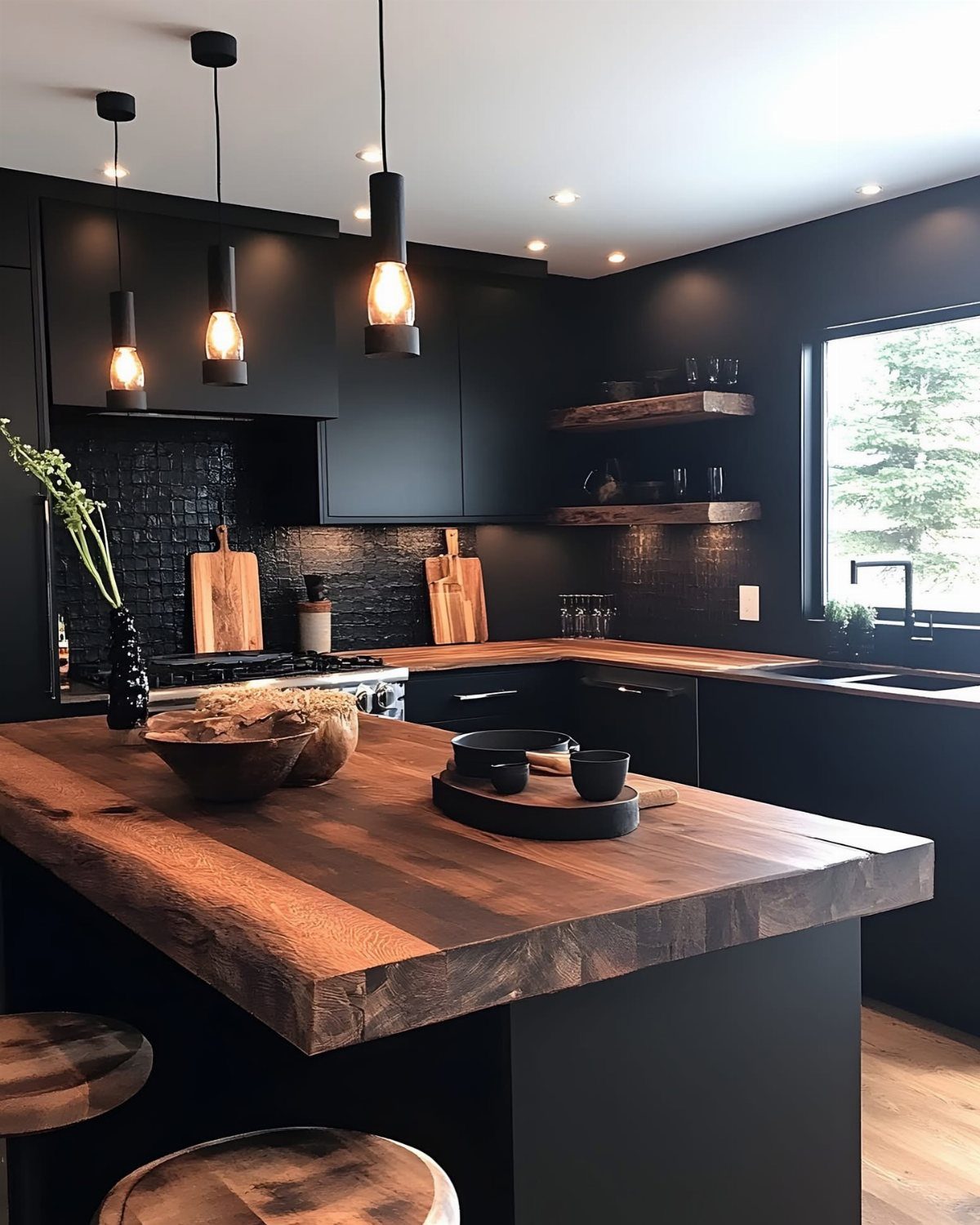
Matte black cabinets need a thick slab of wood next to them, or the room feels like a cave.
A chunky wood island top and open wood shelves bring in grain and a warm brown, and the black suddenly looks deliberate.
Match the wood tone on the shelves and the counter so they read as a pair. Black pendants over the island repeat the cabinet color and tie the upper half of the room together.
I prefer a medium, honey-toned wood here over a pale one; it holds its own against the dark.
11. Black and Pink
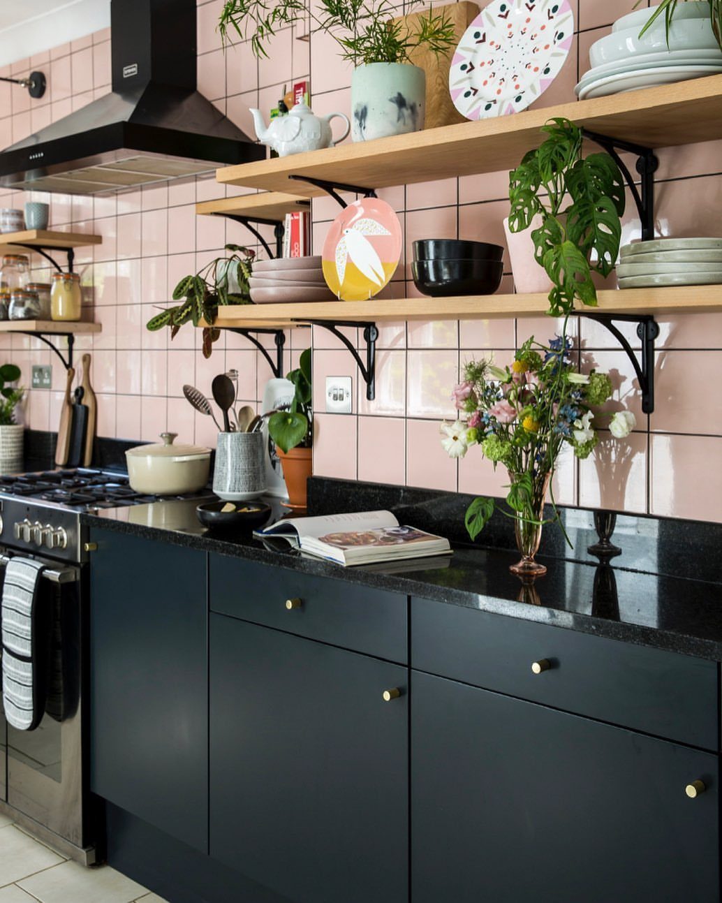
Pink tile on the walls is the loud part of this kitchen, and black is what keeps it from going sugary.
Matte black lower cabinets and a black counter ground all that color, and a black range hood repeats the shade up high.
Open wood shelves with plants and dishes soften the contrast and add a natural note. I would pick this over pink with white if you like a kitchen with some attitude.
Use the black on the lower half only. Pink wall tile stays the star that way.
12. Deep Reds
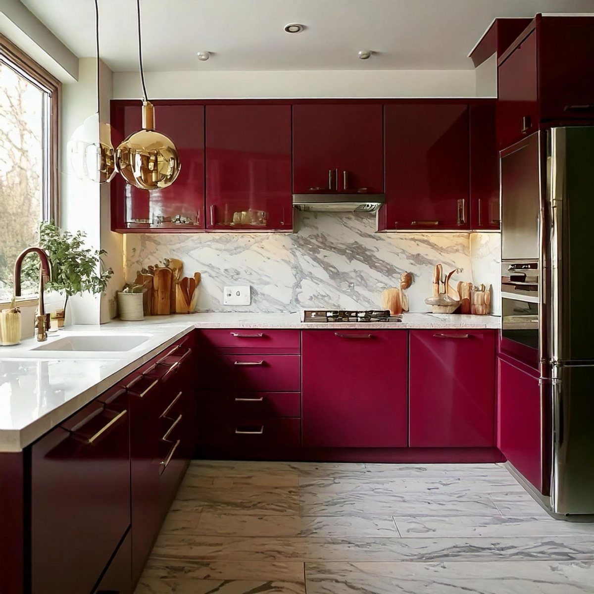
Deep red cabinets in a glossy finish act like a piece of lacquered furniture, and white marble counters and floors give them a clean frame.
The veining in the marble adds a black-and-white pattern that keeps the red from feeling flat.
Brass or gold fixtures warm up deep red cabinets, and stainless appliances stay neutral enough to sit beside them without a fight. I would keep walls and any extra surfaces neutral, because red this strong needs nothing competing with it.
Gloss shows every fingerprint, so a satin finish is the calmer choice if that bothers you.
13. Purple with Natural Wood
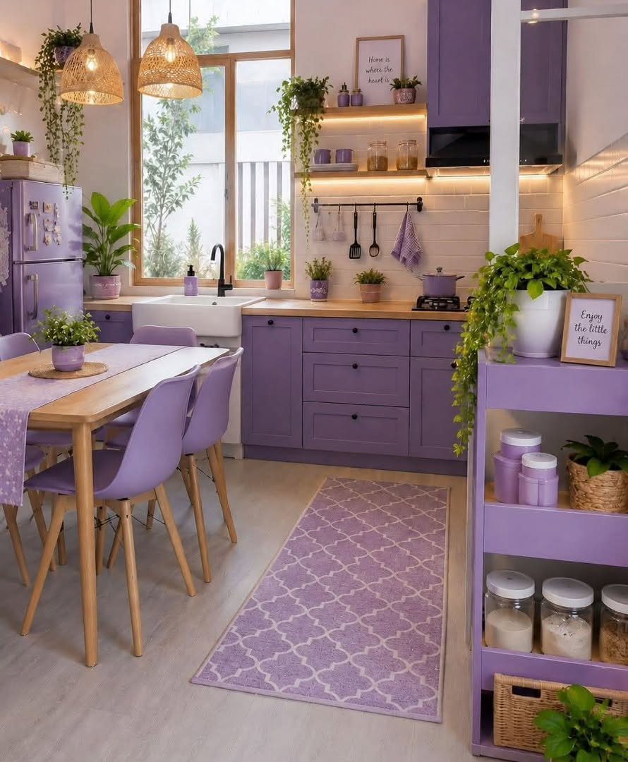
Lavender cabinets and chairs look soft rather than loud when the countertops and dining table stay in raw, light wood. The grain gives the pastel something to lean on.
I would add ceramics in cream or off-white, since they echo the wood without competing with the purple. Keep the shade dusty and muted; a saturated purple would fight the pale wood instead of resting against it.
14. Black and White
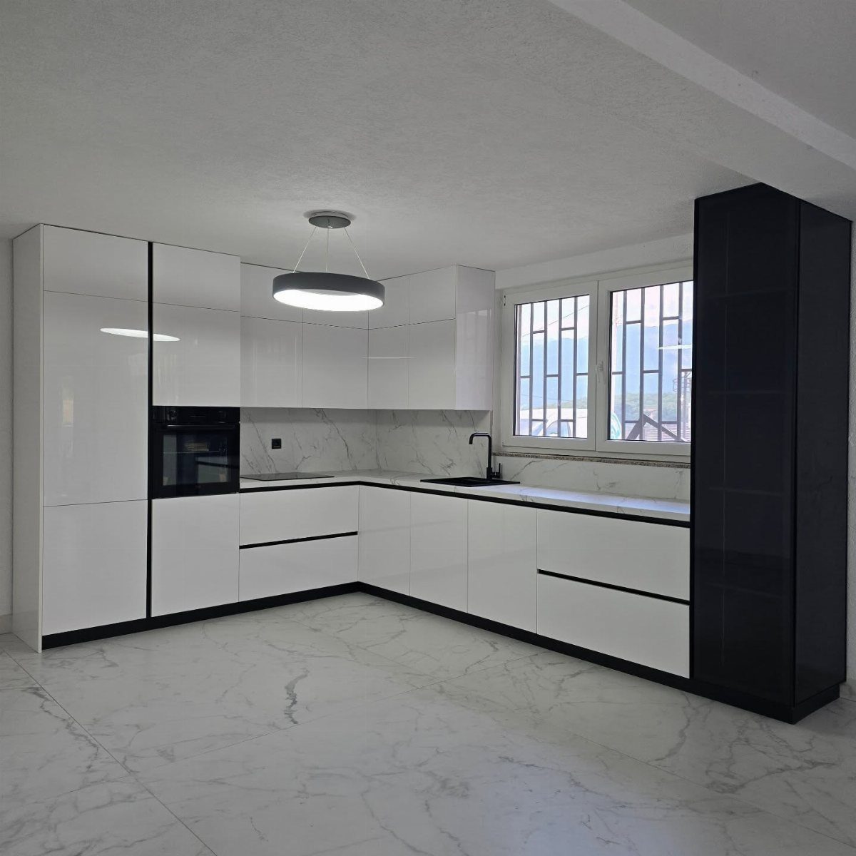
Glossy white cabinets with one tall black cabinet is a clean way to get high contrast without painting the whole room dark.
White marble on the floor and backsplash keeps the walls bright, and the black reads as a deliberate anchor.
A round pendant repeats the black in a different shape. I would stop at those 2 black pieces; more and the sleek look turns busy.
15. Green and White
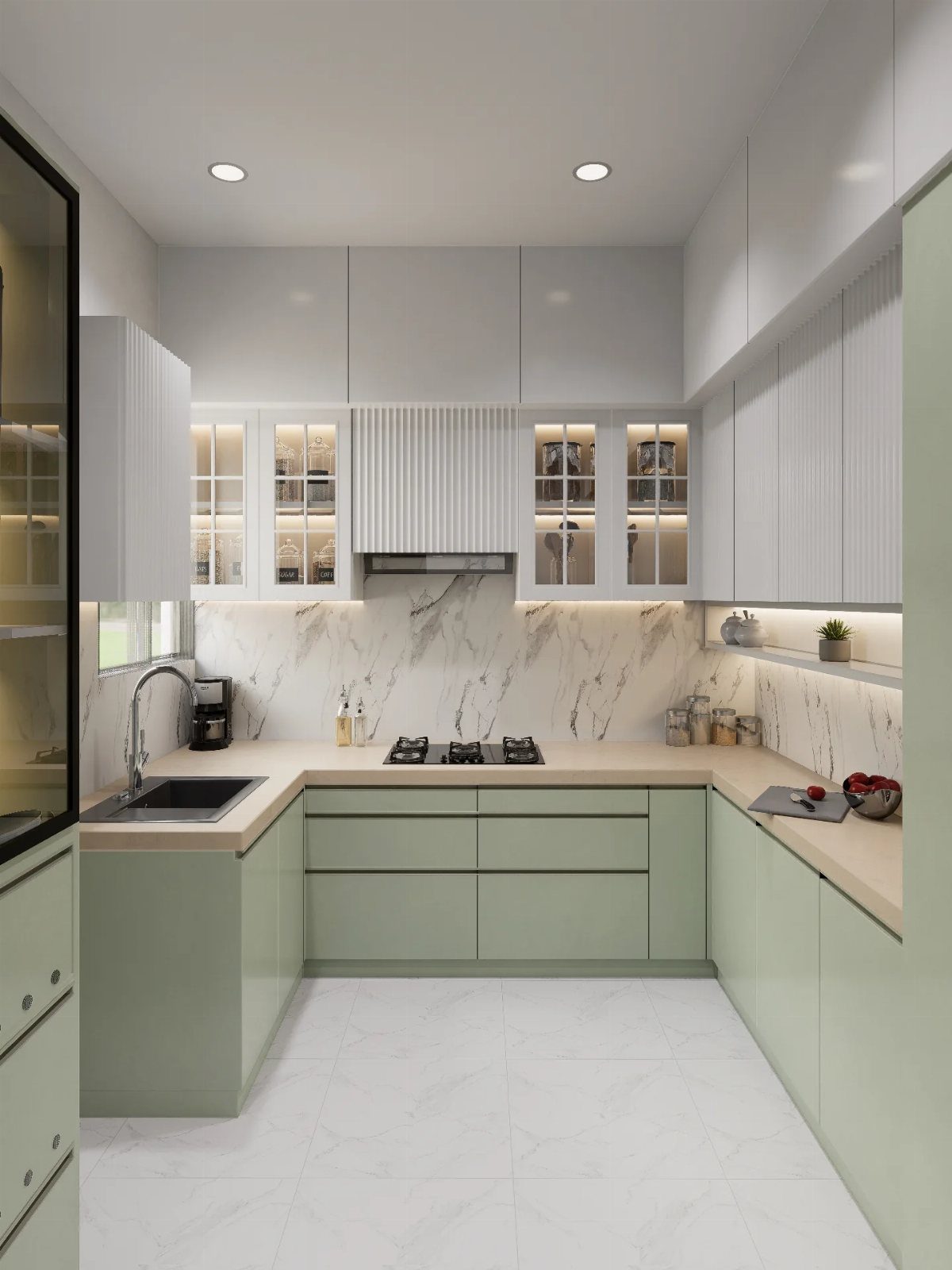
Sage on the lower cabinets and white on the uppers puts the color where you can reach it and keeps the eye line light.
Paint is the cheap route: the darker shade below also hides scuffs from daily traffic better than white would.
White marble on the backsplash and white tile on the floor let the green stand out. On a tight footprint, I prefer this split to all-green cabinets, because the uppers stay open and airy.
16. Barn Red and Sage
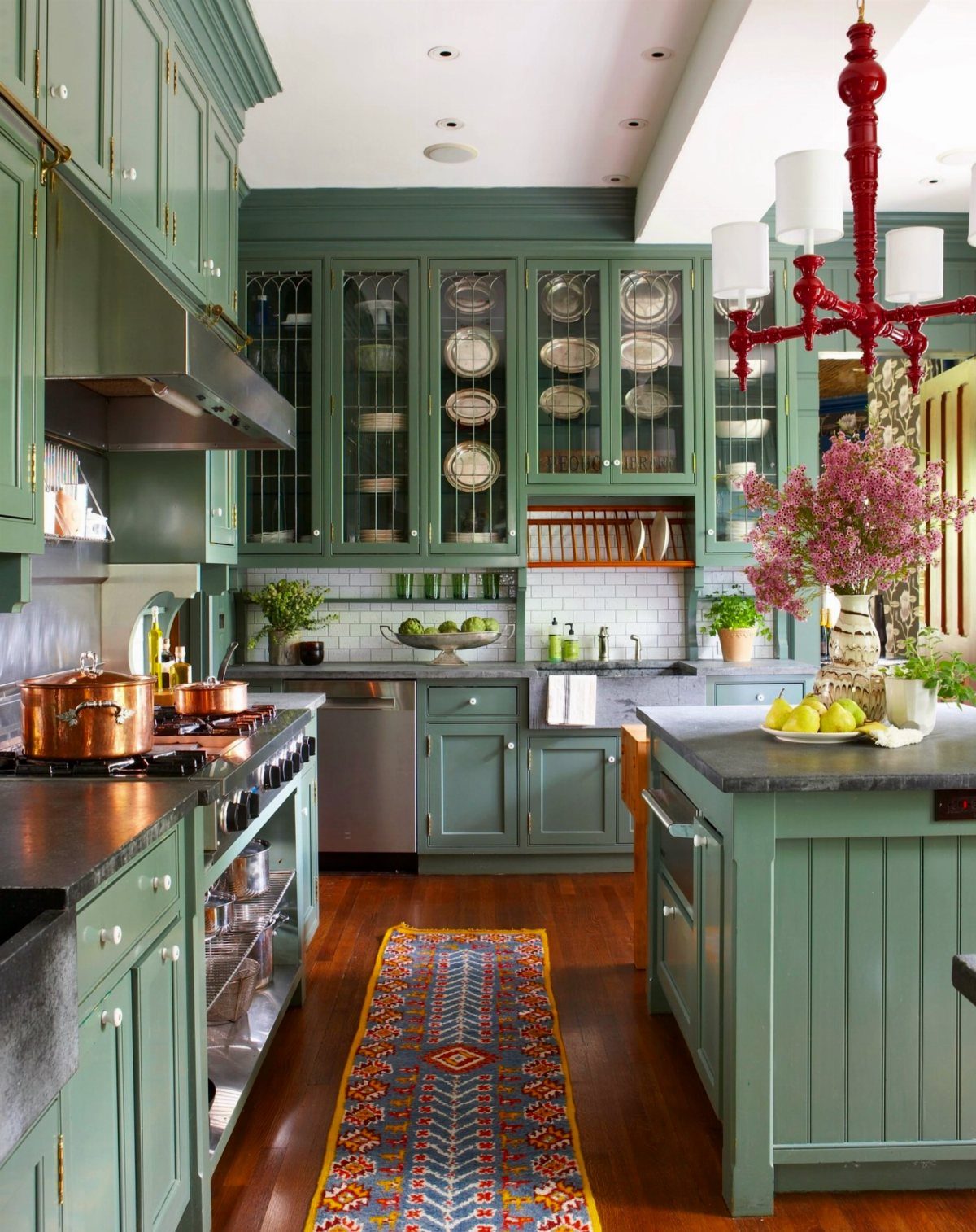
A muted barn red works best in small doses against sage, and a red chandelier is a smart way to do it because a light fixture is easy to swap if the shade bothers you.
Dark countertops give the sage a deep base to sit on.
Pull the red into a patterned runner rug on hardwood to tie the floor to the ceiling. Choose a dusty red over a bright one, or the sage will look washed out beside it.
17. Turquoise and Terrazzo
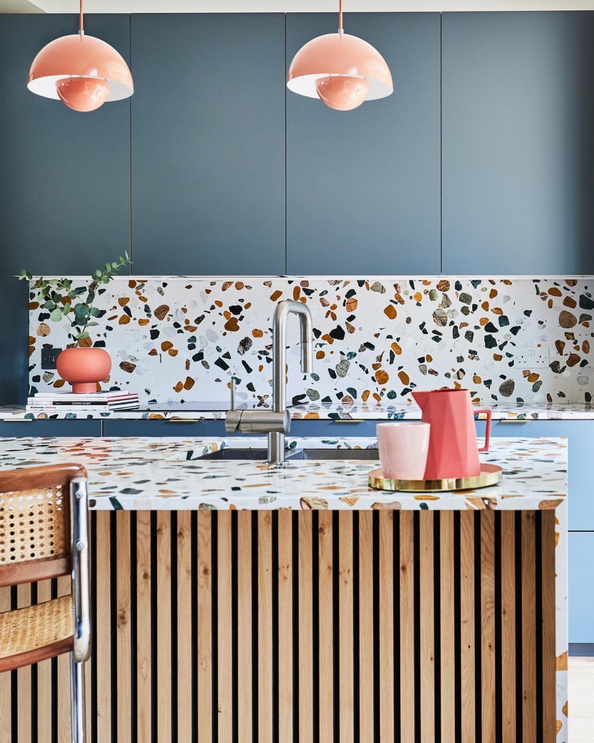
Terrazzo with chips of pink, white and grey is busy, so the turquoise cabinets should stay flat and plain. Run the terrazzo as both backsplash and countertop and the pattern reads as one big surface instead of a scattered accent.
Wood under a saturated color, like a slat island base, adds warmth that paint alone can’t. Pulling the pendant color from one of the chips in the terrazzo makes the lights look planned instead of added later.
18. Light Sage and Red Wood
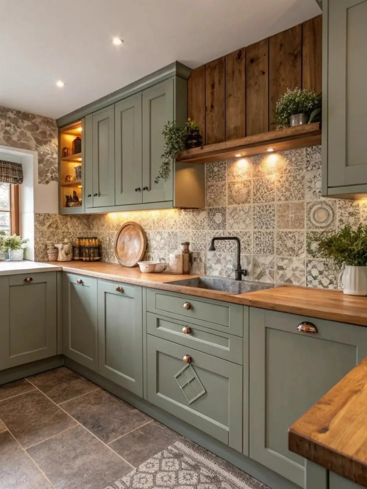
An avocado-leaning sage is warmer than the grey-green most people picture, and that warmth is why it sits well beside red-toned wood.
Wood countertops and a matching wall panel keep the red in one family, so the green has a single partner.
Sample the sage next to your actual wood before buying paint; the undertones need to agree.
19. Cool Tones
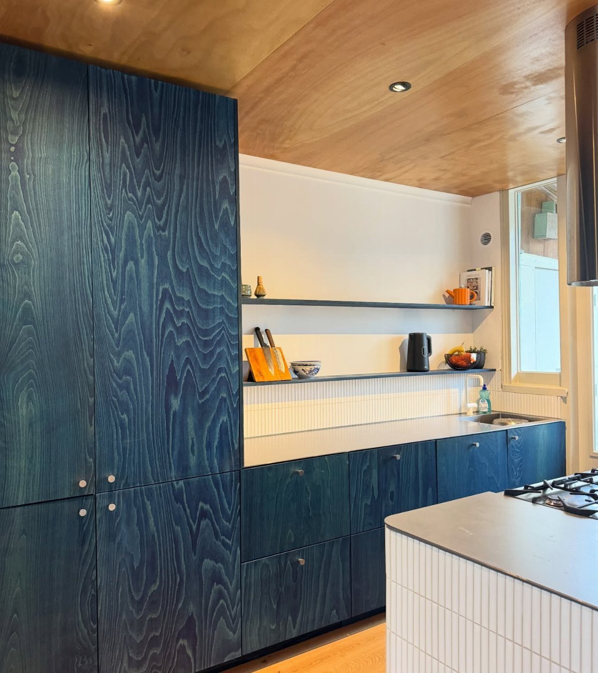
Blue wood-grain cabinets under a wood ceiling give a plain white room a lot of depth without adding a single extra color. Cool blue and warm timber balance each other, so nothing needs to be piled on top.
A grey counter and white tile sit quietly beside the blue. A green cabinet in the same spot works just as well if blue feels too cool for your light.
20. Sand and Ivory Kitchen
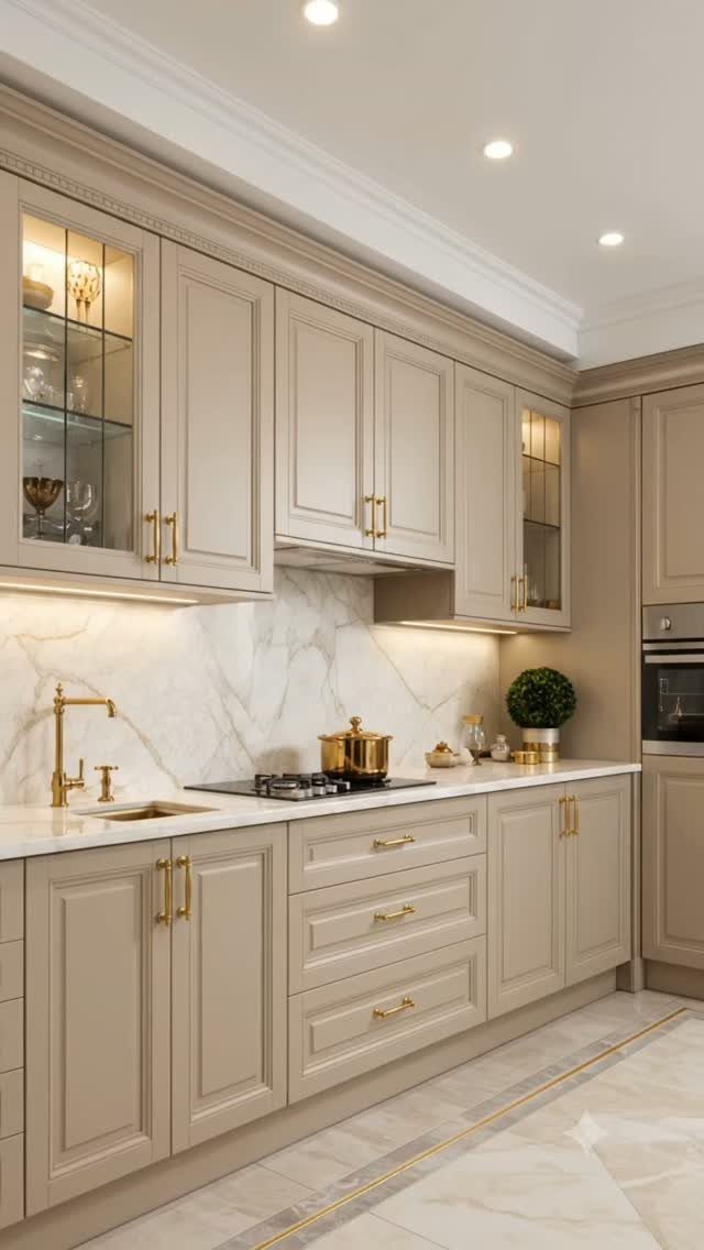
Sand cabinets with ivory marble make a kitchen that feels soft but still traditional. The 2 shades sit close together, so the veining in the stone does the visual work.
Brass pulls and a matching brass faucet add one more layer of warmth.
I would keep every metal finish matched, since one stray chrome piece would stand out against that much warmth. A bright room helps, because sand can go flat in dim light.
21. Red and White
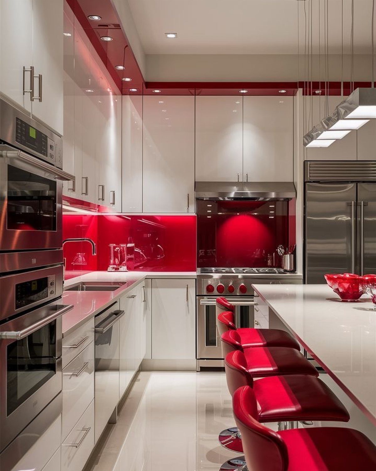
Red this loud needs a lot of white around it, and a glossy white cabinet run gives it exactly that. A red backsplash with matching red bar stools makes the color feel planned rather than random.
Stainless appliances stay neutral beside the red. If a full red wall feels like too much commitment, start with the stools alone; they are the cheapest piece to swap out later.
22. Blue and Tan
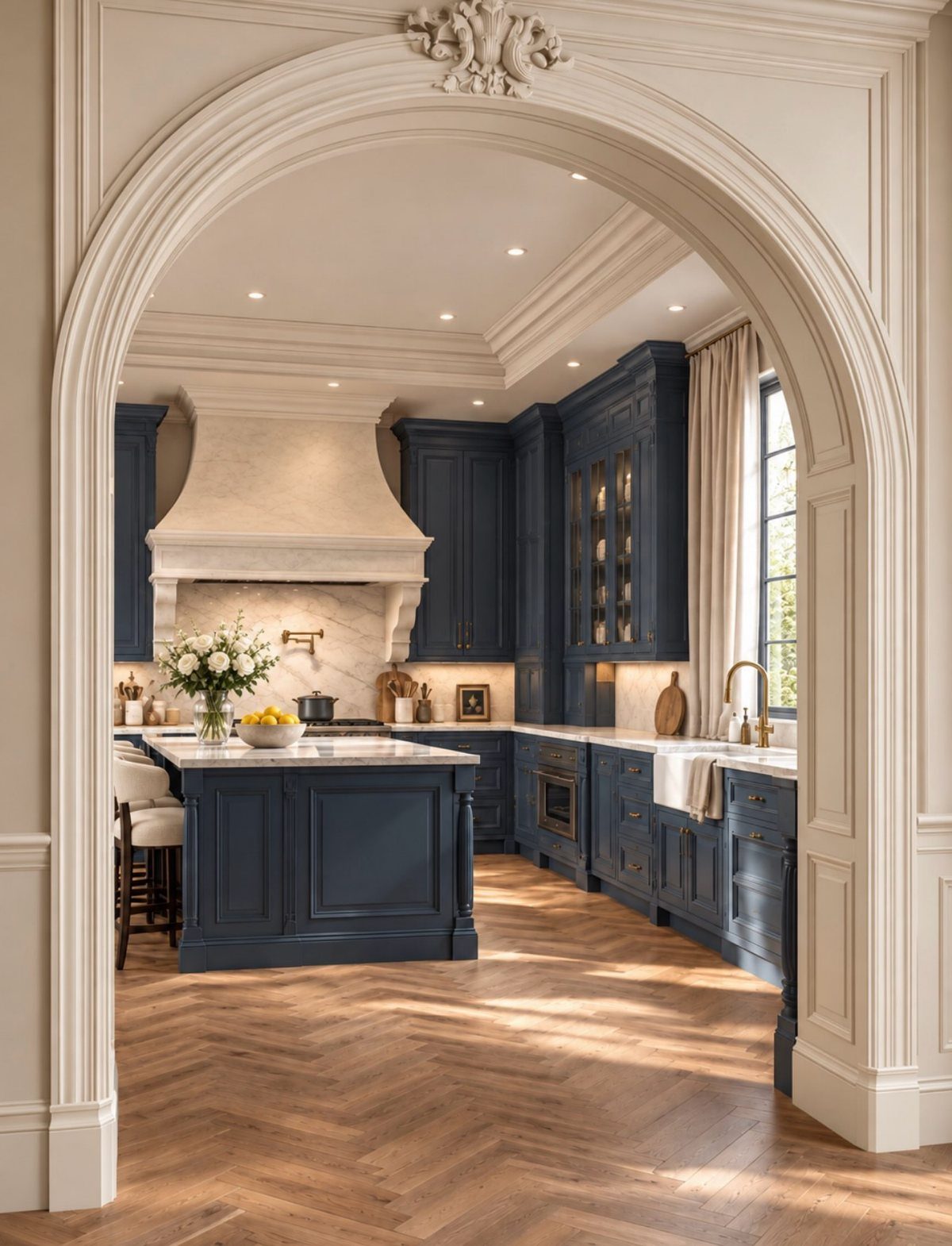
Navy cabinets can feel cold on their own, and tan is the quick answer.
Herringbone wood floors in a warm tan bring the heat back, and white marble on the range hood keeps the dark blue from closing in the room.
A mid-tone tan beats a pale one here, because it gives the floor enough weight to stand up to the navy. Warm wood in stools or a cutting board carries the same note higher up.
23. Pretty and Pink
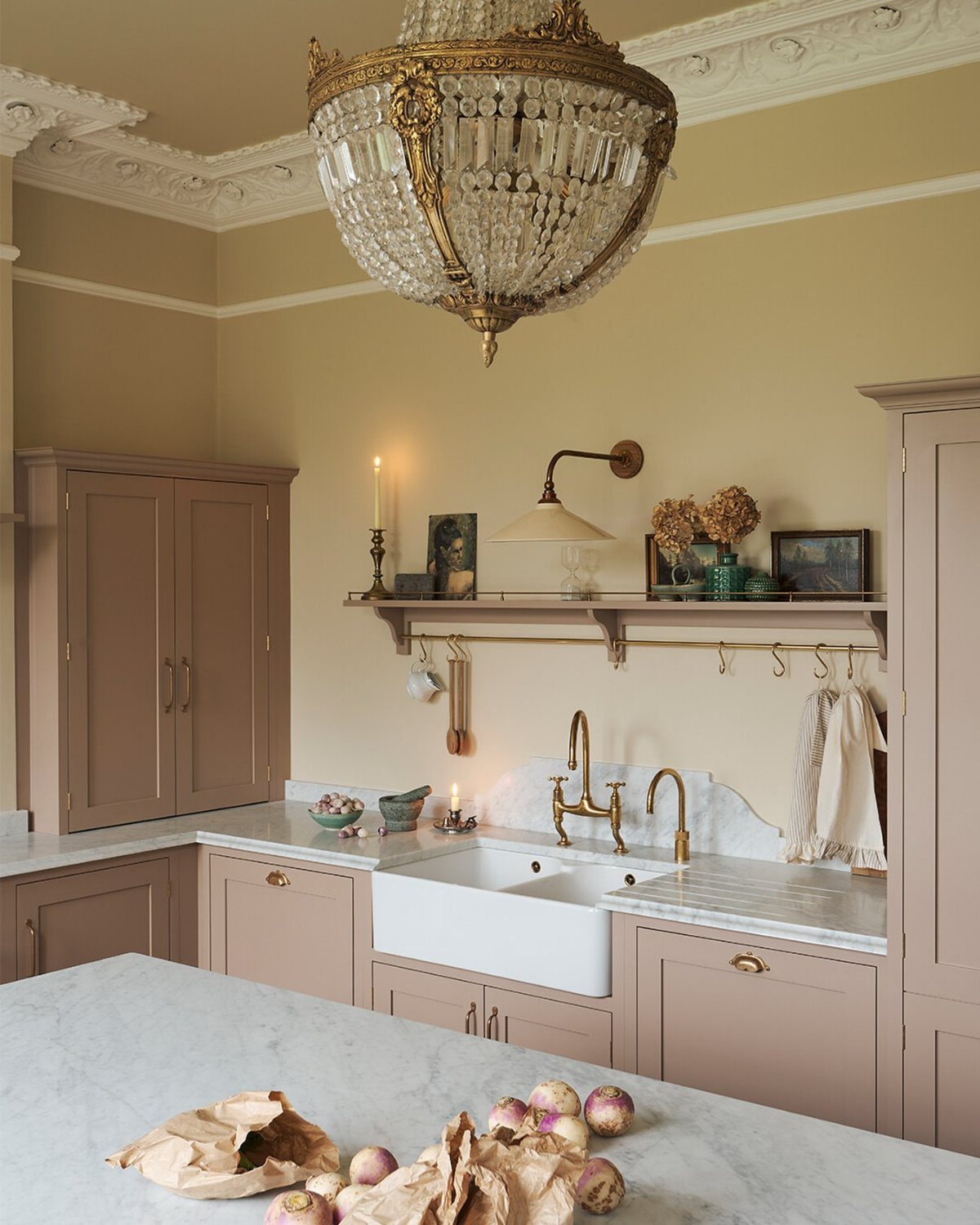
Dusty pink cabinets read as grown-up when the surfaces around them stay white and stone. White marble counters and a white farmhouse sink give the blush a clean backdrop, so the pink never turns candy-like.
Gold fixtures add a warm glint, and a crystal chandelier pushes the room toward formal. For a more relaxed look, I would swap the chandelier for a simple pendant and keep everything else.
24. Green with Envy
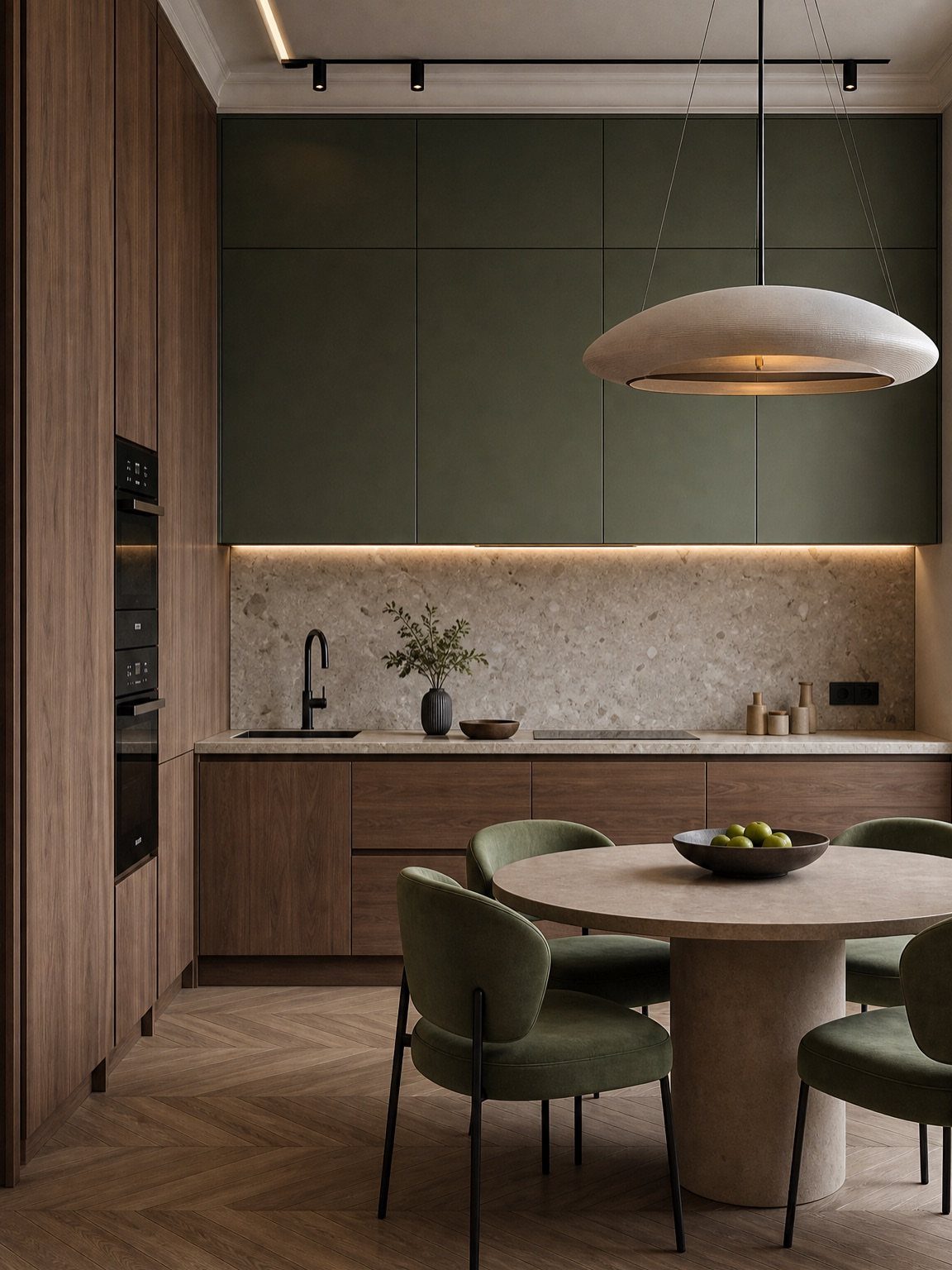
Dark green uppers over oak lowers put the heavy color overhead and the warm wood at hand height, which is a smart split.
Oak wall panels carry the wood up the wall so the green doesn’t feel like it’s pressing down.
Green chairs at a round oak table repeat the cabinet color, and a large white pendant keeps the center of the room light. I like this better than all-green cabinets for a kitchen that gets limited daylight.
25. Lemon and Lime
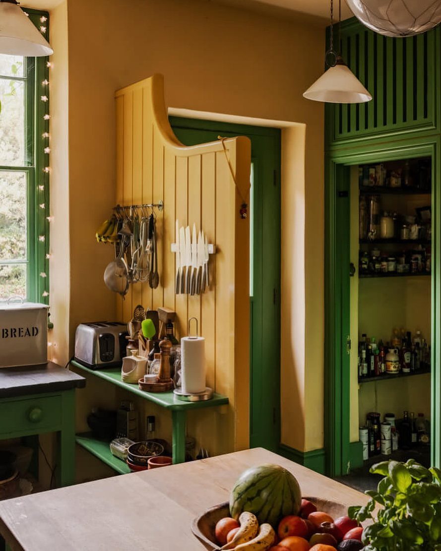
Yellow and green sit side by side on the color wheel, which is why this pairing feels lively without clashing. Green cabinetry carries the weight, and a small dose of yellow, like a wall rack, adds the zing.
I would keep the yellow to accessories you can swap. A rack, a bread box or a bowl of lemons costs little and changes in a minute if the shade wears on you.
Wood paneling between the 2 colors calms them down.
26. Creams with Wood
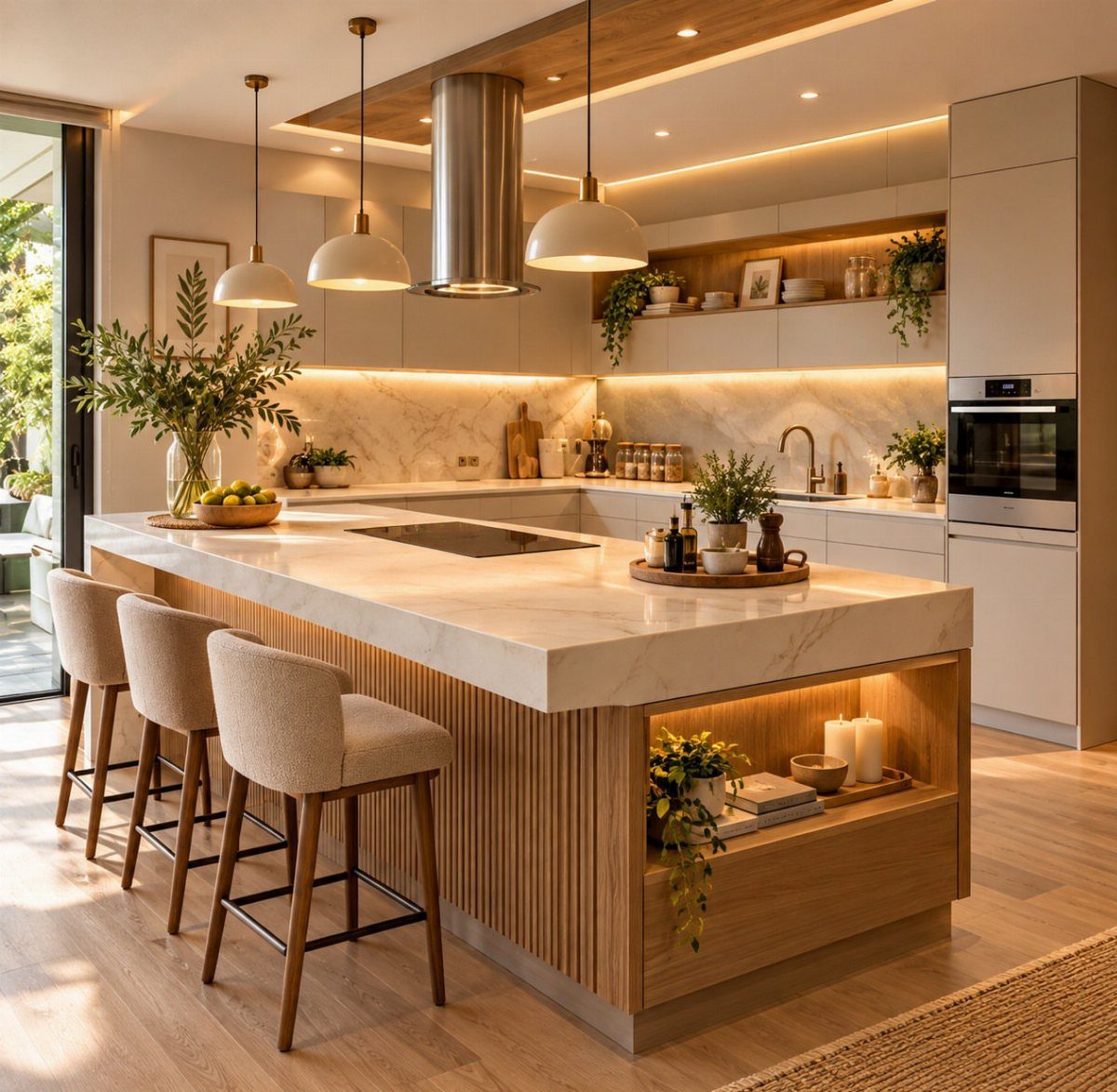
Cream cabinets next to a white marble island keep the palette soft, and light wood is what stops it from reading flat.
Cream bar stools tie the island back to the cabinet color, so the seating looks chosen rather than bought separately.
I would pick one wood tone and repeat it, because several pale woods in one room can look like a mismatch. If you like a warmer mood, terracotta in a vase or a bowl adds it without a single repaint.
27. All-over Whites
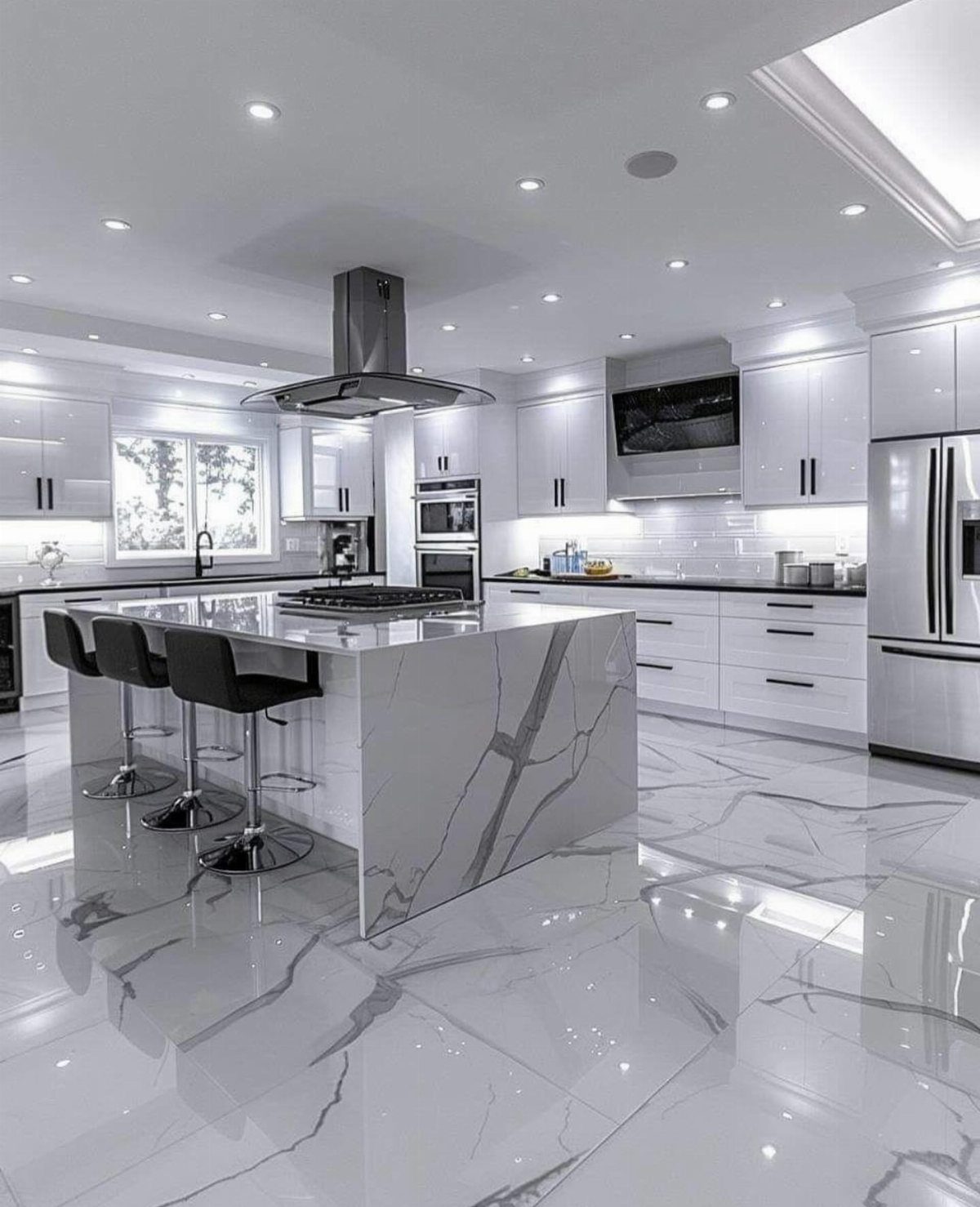
White kitchens only look boring when every white is the same. Mixing a warm white on the cabinets with a cooler white marble on the island and floor adds depth with no extra color.
Black stools and black counters give the eye somewhere to land, and I like that better than a pure white island floating in white. Stainless appliances fit right in.
Hold paint chips against the marble at home, since whites show undertones fast.
28. Olive and Cream Cabinets
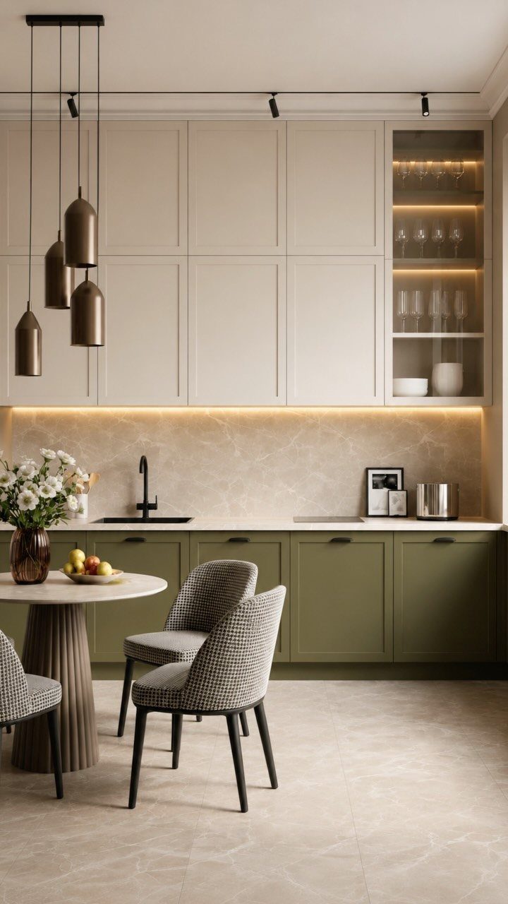
The deeper shade sits low, where scuffs happen, and the cream uppers bounce light around.
Bronze pendants suit olive better than chrome, since both lean warm. A marble backsplash between the 2 cabinet colors keeps the join clean.
If the room is small, I would choose this split over olive on every cabinet.
29. Grey with Gold Accents
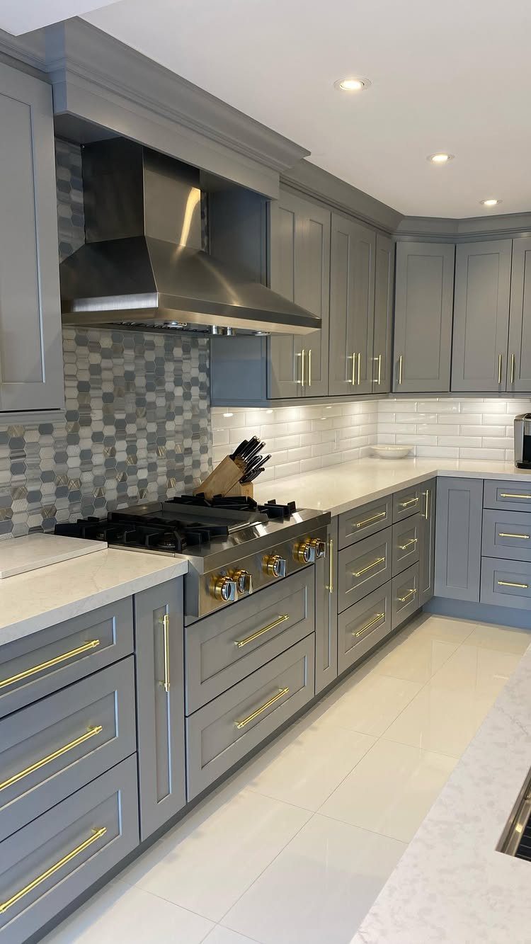
Grey cabinets can look flat, and gold hardware is the cheapest way to fix that. Swapping handles takes an afternoon with a screwdriver, so you can try the look before committing to anything bigger.
White countertops keep the grey crisp, and a grey and white tiled backsplash links the two without adding a new color. I would keep the gold to the handles so the kitchen stays polished and does not tip into flashy.
Choose a warm grey if your light is dim.
30. Sage and Light Wood
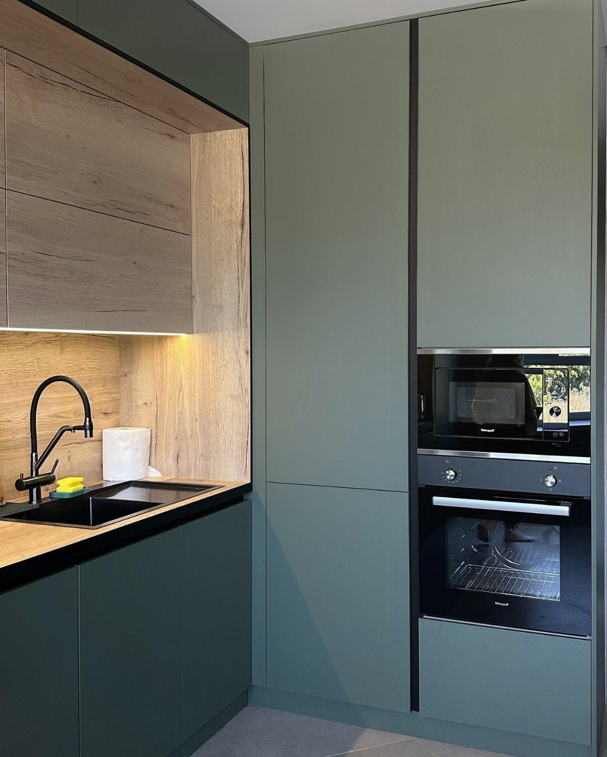
Matte sage with light wood paneling is a quiet pairing. The wood adds warmth that green paint alone can’t, and the matte finish keeps the cabinets soft instead of shiny.
Black accents such as the faucet, sink or appliances give pale sage and light wood a firm outline. I would stop the black at those fixtures so the sage and wood stay the main story.
31. Grey and Warm Wood
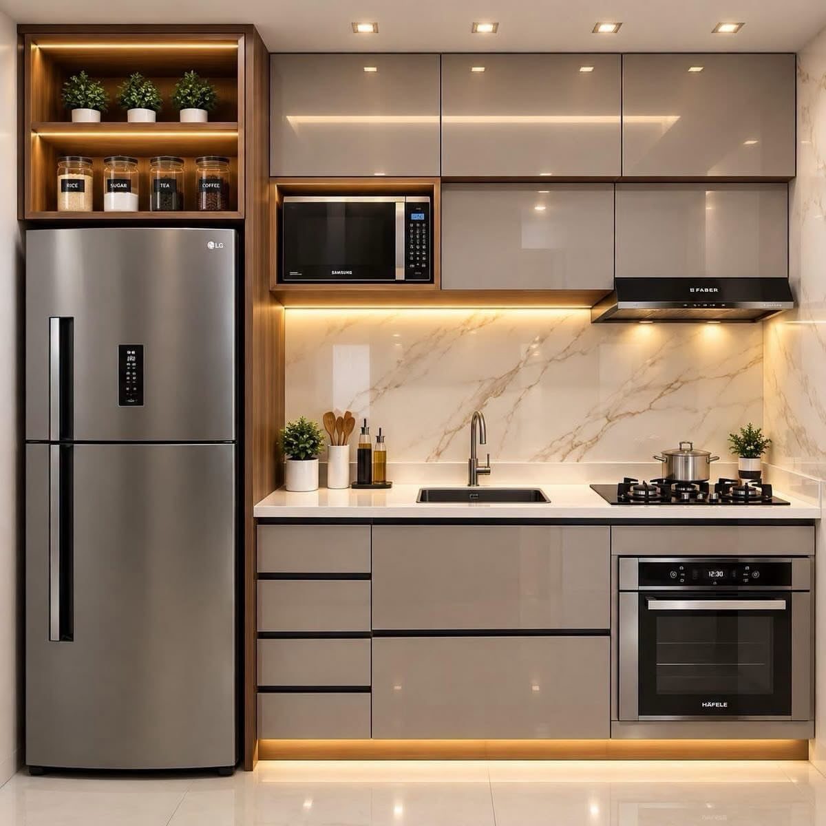
Glossy grey cabinets can read cold, and warm wood shelving is what brings the temperature back up. White marble on the backsplash keeps the grey from turning heavy, so the 3 materials share the work evenly.
I would choose a wood with a honey or amber tone over a pale one, since the contrast with the grey is what makes it look chosen. Stainless appliances blend in with the grey without any extra effort.
Fingerprints and splashes stand out on high gloss, and a satin finish hides them far better in a kitchen that gets used all day.
32. Orange and Patterned Tile
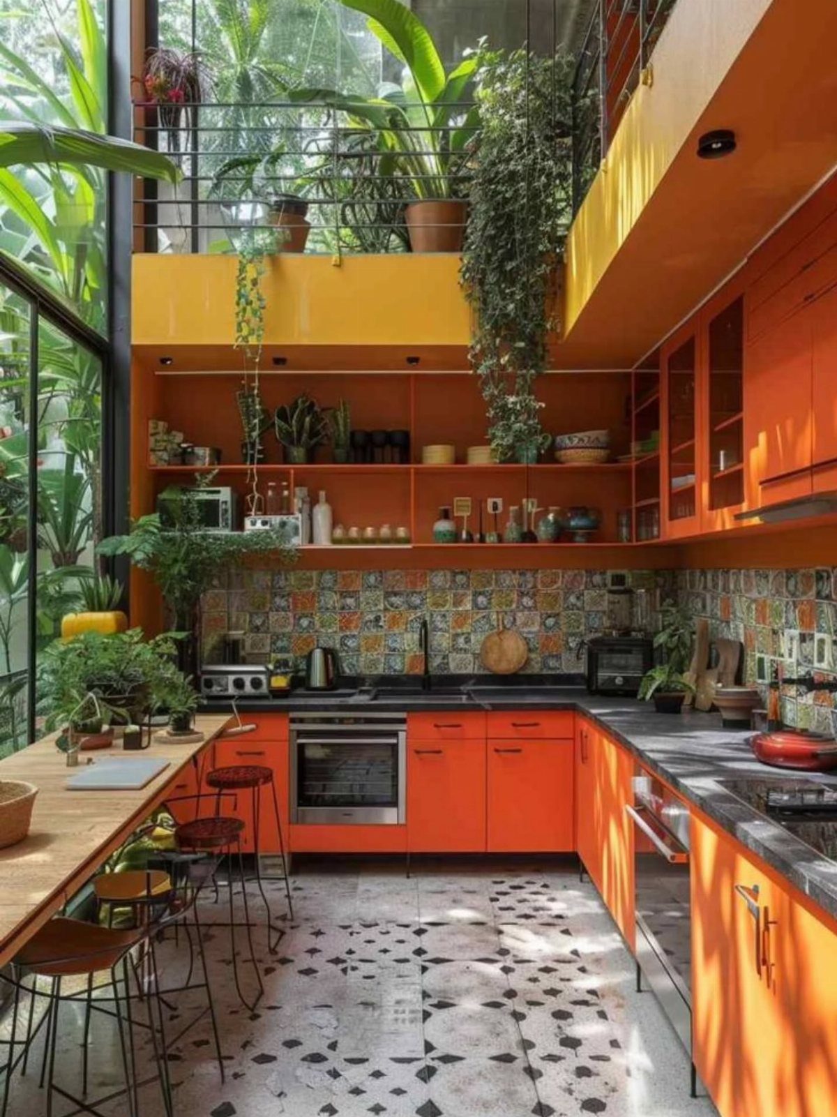
Bright orange cabinets need a dark counter to hold them down, and black does that job. The patterned tile behind them can carry several colors because the cabinets and counter stay solid.
Open shelves and a wooden island add warmth, and plants soften all that saturation with green.
I would keep the tile in charge of the pattern and leave the shelves lightly styled, since orange plus busy tile is already a lot.
Pick one color from the tile and repeat it in a bowl or a towel.
33. Purple and Gold
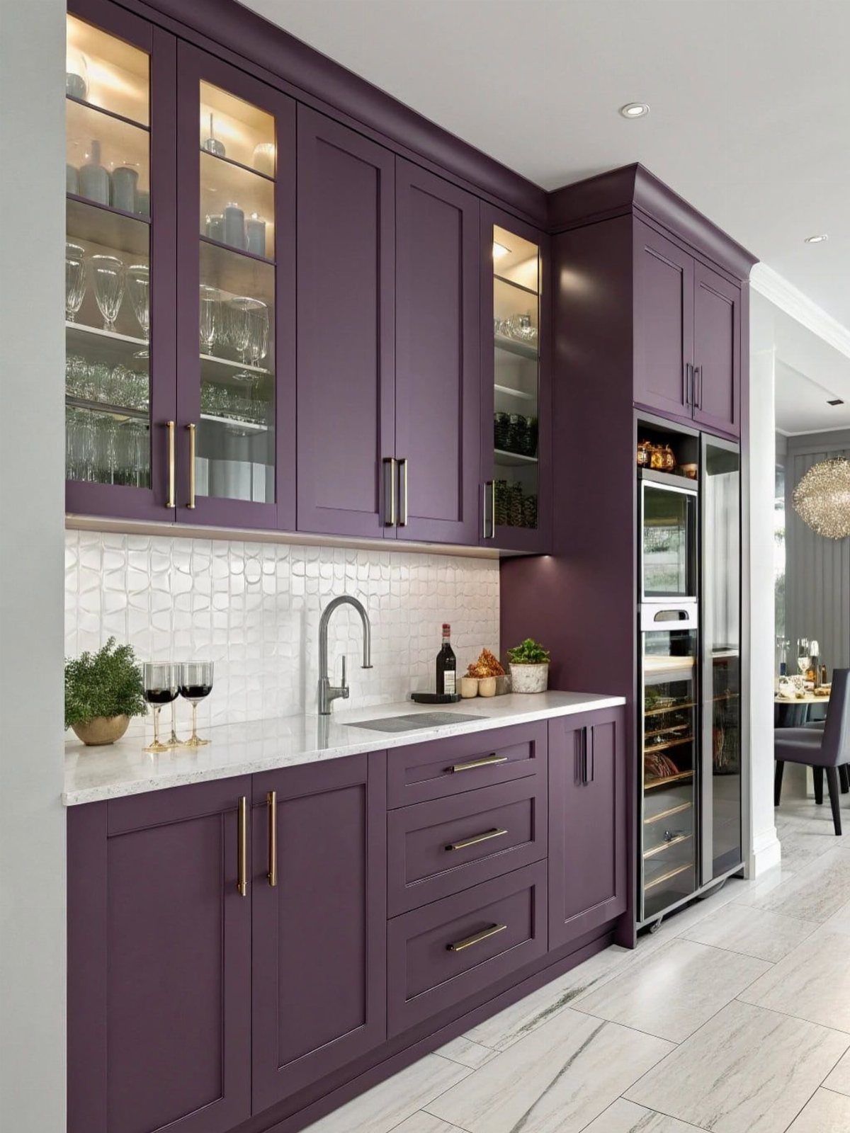
Deep purple cabinets feel rich rather than heavy once gold hardware and white marble are around them. The gold works like jewelry on the doors, and the marble counters and floor bounce light back into the room.
A light tiled backsplash keeps the wall quiet. I would try the gold on the handles first, since a screwdriver and an afternoon let you test the look before you commit to anything else.
A built-in wine cooler suits the dark cabinetry, but it is a bigger purchase, so skip it if budget is tight.
34. Red and Black
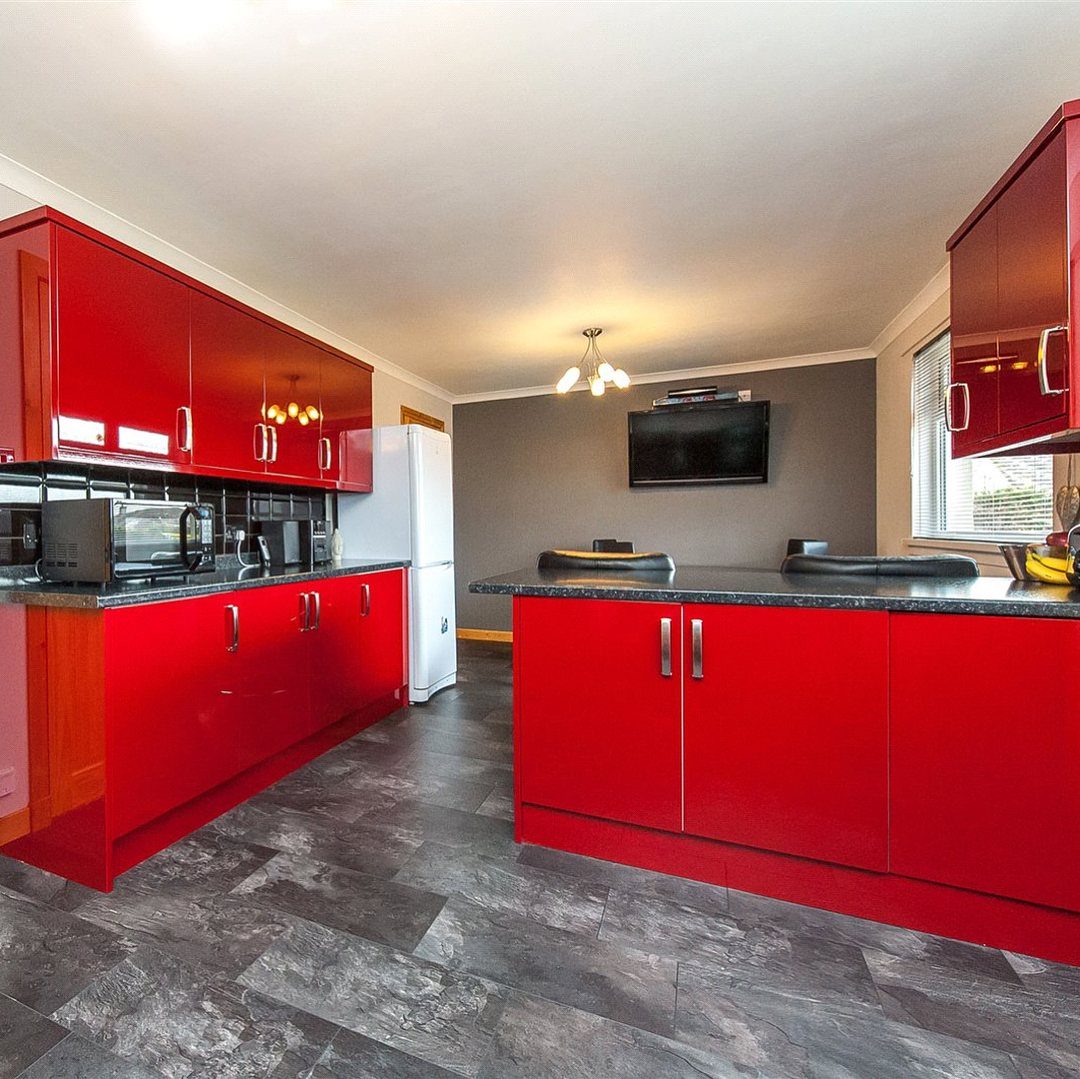
Red cabinets with black counters make a high-drama pair, and a black island is how this kitchen splits the red into 2 blocks. Grey tile on the floor stays out of the argument and gives both colors a calm base.
Glossy red is bold, so I would keep the walls grey as well and give the cabinetry full attention. Gloss shows fingerprints, which is worth knowing before you choose it for cabinets you touch all day.
Black on the island alone, with lighter counters elsewhere, is a softer version if a full black run feels like too much.
Choose Colours for the Room
Start with the window.
Light direction changes how paint reads: a north-facing kitchen gets gray, cool light all day, so I lean toward warm creams, soft terracotta and honey wood there, while a south-facing room has enough sun to handle blue-greens and cool grays without turning chilly.
Room size is the second check. Lighter shades open up a compact layout and bring brightness to a dim room, and cream, pale grey or soft blue are easy picks for a small kitchen.
Darker colors add depth, but I would save them for a larger kitchen or one with plenty of daylight.
Then stand in the doorway and look at the rooms next to the kitchen. If you can see the living room or hall from the stove, the cabinet color should sit comfortably with those walls.
Cabinets, floors and counters are big-ticket items, so a wrong guess costs real money. Settle the room’s light and size before you fall for a palette.
Test Colours Before Committing
Light changes color, so a sample that looks right in the store can shift once it’s in your kitchen.
Set every sample you’re weighing next to the others, in the room itself, and look at them in the morning, in the afternoon and again at night under the lamps you actually use.
For a cheap first pass, copy your kitchen’s wall drawings and fill them in with crayons or colored pencils. It takes an evening, and it shows fast whether two colors balance or one runs over the other.
An online kitchen visualizer does the same job on screen if you’d rather not draw. I would still check your final pair in person, since a screen can’t show how your own light treats them.
Frequently Asked Questions
What are some good color schemes for my kitchen?
Navy cabinets with white counters give the strongest contrast, and grey counters take the sweetness out of sage cabinets for a calm, modern room.
Stark white can feel clinical, and oak cabinets or stools set against white marble soften it right away.
Dark green with a brown partner, such as leather barstools, feels lived in. Pink and green can work too when the pink is soft and the green anchors the room.
Which 3 color combination is best?
No single trio wins everywhere. What works is one color leading, a second in support and a third kept to a few small pieces.
A palette of sage, gray and pale wood, with one black oven as the contrast, is a good example of the 3-color rule in practice.
Your room’s light and your existing finishes should guide the final call, so test samples in your own space.
Which color is best for a kitchen and living room?
Shades of one base color, used in different finishes, link the two rooms without making them match.
That variation keeps each space from looking flat. Test your samples in your own light before committing, since undertones shift from room to room.
What is the best color to paint a kitchen?
There is no single best color; it depends on your kitchen and your taste.
White, gray, blue, red, yellow and green are the most common in US kitchens. Hold your sample next to your actual wood or counters so the undertones agree, and pick a warm grey if your light is dim.
What is the most popular color for a kitchen?
White is still the timeless choice, and most US kitchens run white, gray, blue, red, yellow or green. Bright colors, jewel tones and dark moody shades are drawing more attention lately.
White stays the most popular pick, and mixing two tones of it, a creamy shade on the cabinets and a crisper one in the marble, keeps the room from going flat.
What is the best color for a small kitchen?
Small kitchens don’t have to stay neutral; yellows, mauves and greens all work. Painting only the base cabinets sage and leaving the uppers white keeps the walls feeling tall and stops a small room from closing in.
Down low is where shoes, chair legs and mop buckets leave their marks, and sage hides those far better than white.